Playing with colors
For the last assignment, I used processing to create a blossoming flower: moving the mouse horizontally, the flower will blossom, and moving the mouse vertically, the circles will rotate.
Hue

Saturation
Brightness

Color challenge

yining ·
For the last assignment, I used processing to create a blossoming flower: moving the mouse horizontally, the flower will blossom, and moving the mouse vertically, the circles will rotate.
yining ·
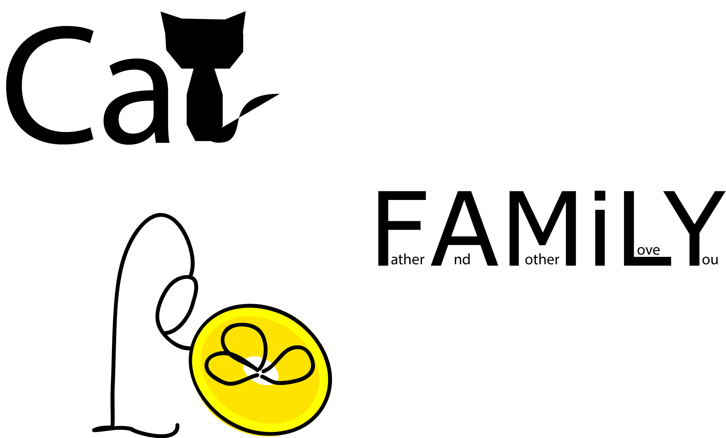
1) Awesome logos

A little history:
The Chanel logo design was designed in 1925 by Coco Chanel herself and remained unchanged ever since. It turned out to be one of the most recognizable symbols in the fashion world with its overlapping double 'C' - one facing forward and the other facing backward. Chanel's logo is frequently seen in perfumes, purses, shoes, and jewelry.

The first reason I like this logo is that the composition is balanced. It's vertically and horizontally symmetrical. It's simple and elegant.
The second thing is the colors of this Logo. The black and white are the main colors of Chanel's clothes. The black is the essential of everything, and it reveals women's radius. Chanel made black as the color of elegance by designing little black dress in 1926. And the color white, the beginning is the white. It captures all the light, it illuminates the face and enhances beauty. I love the two colors, they are simple, elegant and represent the brand.
2) Create the ITP Logo
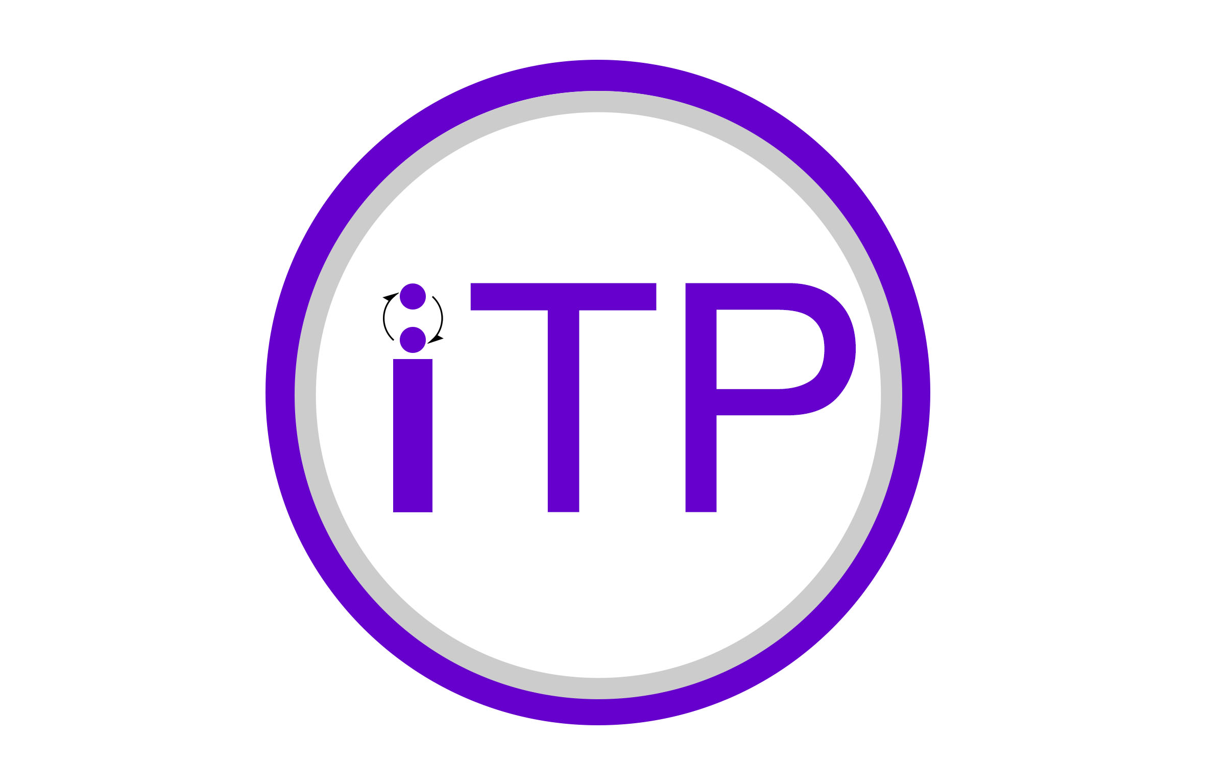
The logo I created for ITP is simple, it focuses on one single meaning:
The idea comes from that ITP's work is to promote interaction. The definition of interaction is a loop, is about two people constantly speaking, thinking and listening to each other. So I drew two circles representing two people, and two arrows representing the loop of conversation.
Also, the color is purple, since we are a part of NYU.

I made various sketches. First, I want to express the meaning of "new possibility" or "digital media", but they can't express the meaning very well. I also want to add mouth and ear on the circle to fully express the meaning of listening and speaking, but I'm not sure it's a good idea, cause logos should be simple and abstract. Actually, I'm confused about how simple a piece of design should be. Most of time, people say, keep it simple, don't put too much on your design, otherwise you may ruin it. But sometimes, I was also worried that it's too simple, it can't support the idea behind it.
yining ·
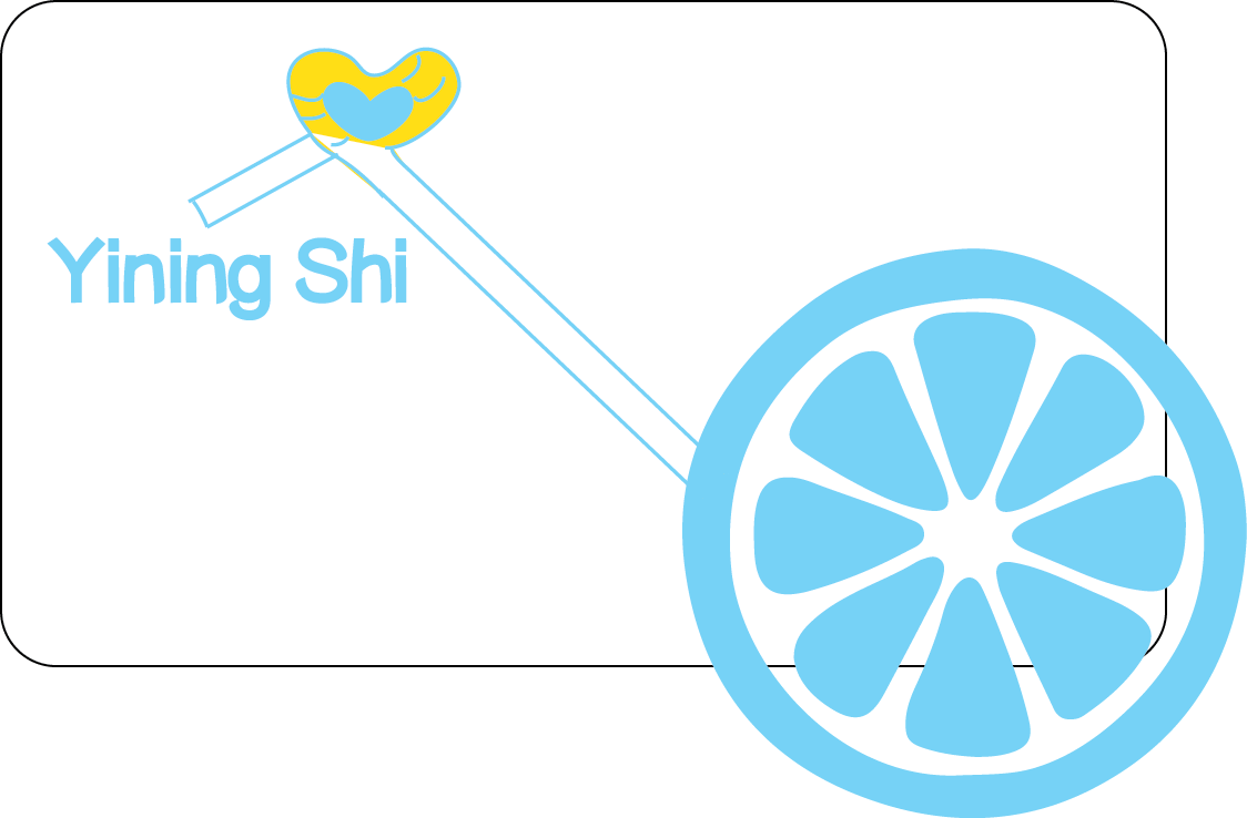
This is my business card. Because my name means lemon, so I decided to use lemon as a logo. I used the color of lemon: yellow and its contrast color: blue.
Also I designed a drinking straw connecting my name and the lemon. I
used the golden ratio to arrange my email address.
I chose this typography because it's simple, neat and a little cute. I think it can show some of my personality. I also made all my informations align to each other.
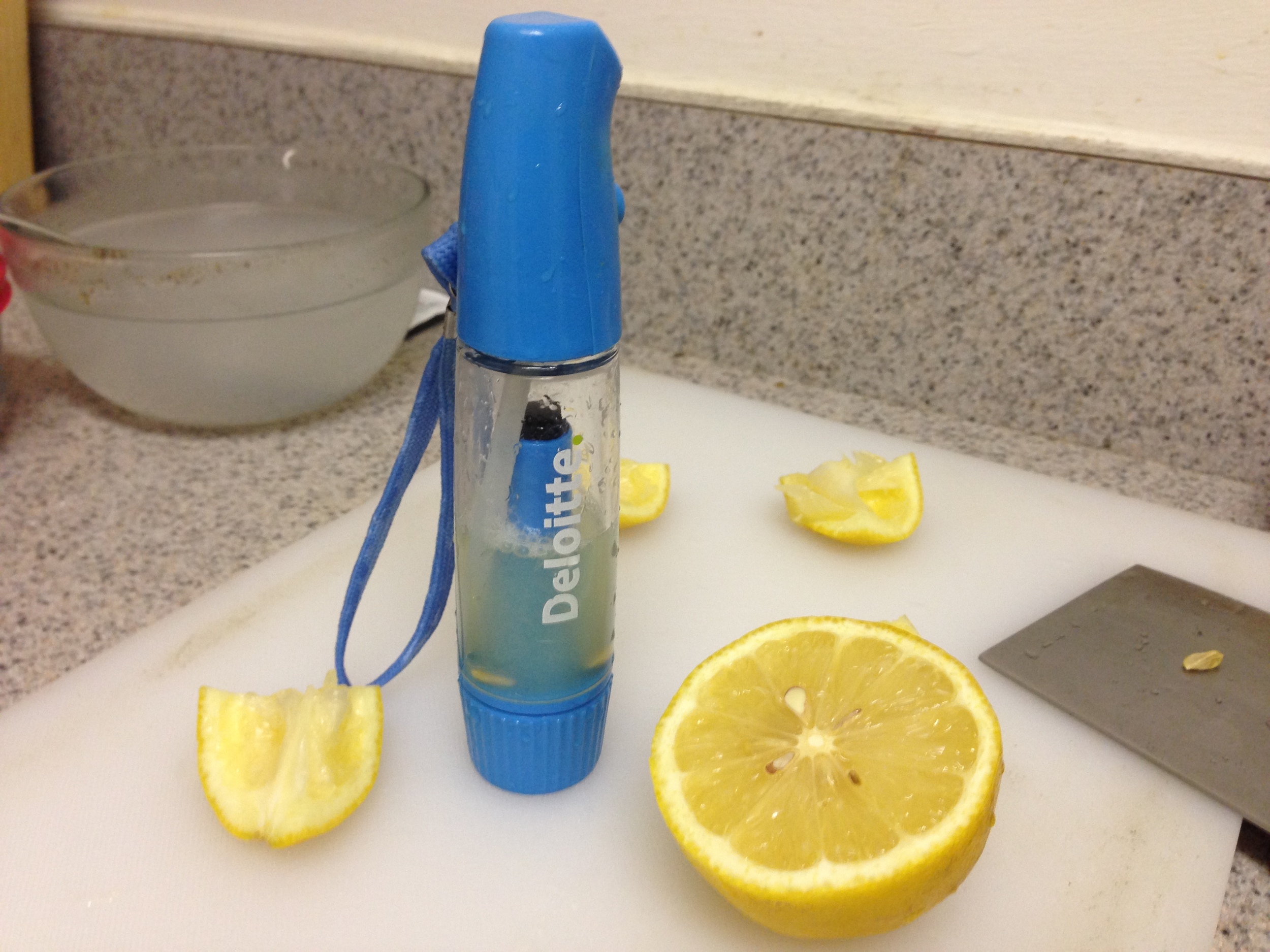
I also want my business card be more special, I sprayed some lemonade to the card, hope it can help people remember me when people smelled the lemonade. But I made a mistake. The lemonade wouldn't volatilize, so people can't smell the lemon, I will use lemon perfume in the future.
Another mistake is that I didn't make the front side and the back side suit each other. I will make it right in the future.
In addition, I used round corners rectangle for the shape of the card, to express a gentle feeling and protect people's fingers from getting hurt.


yining ·

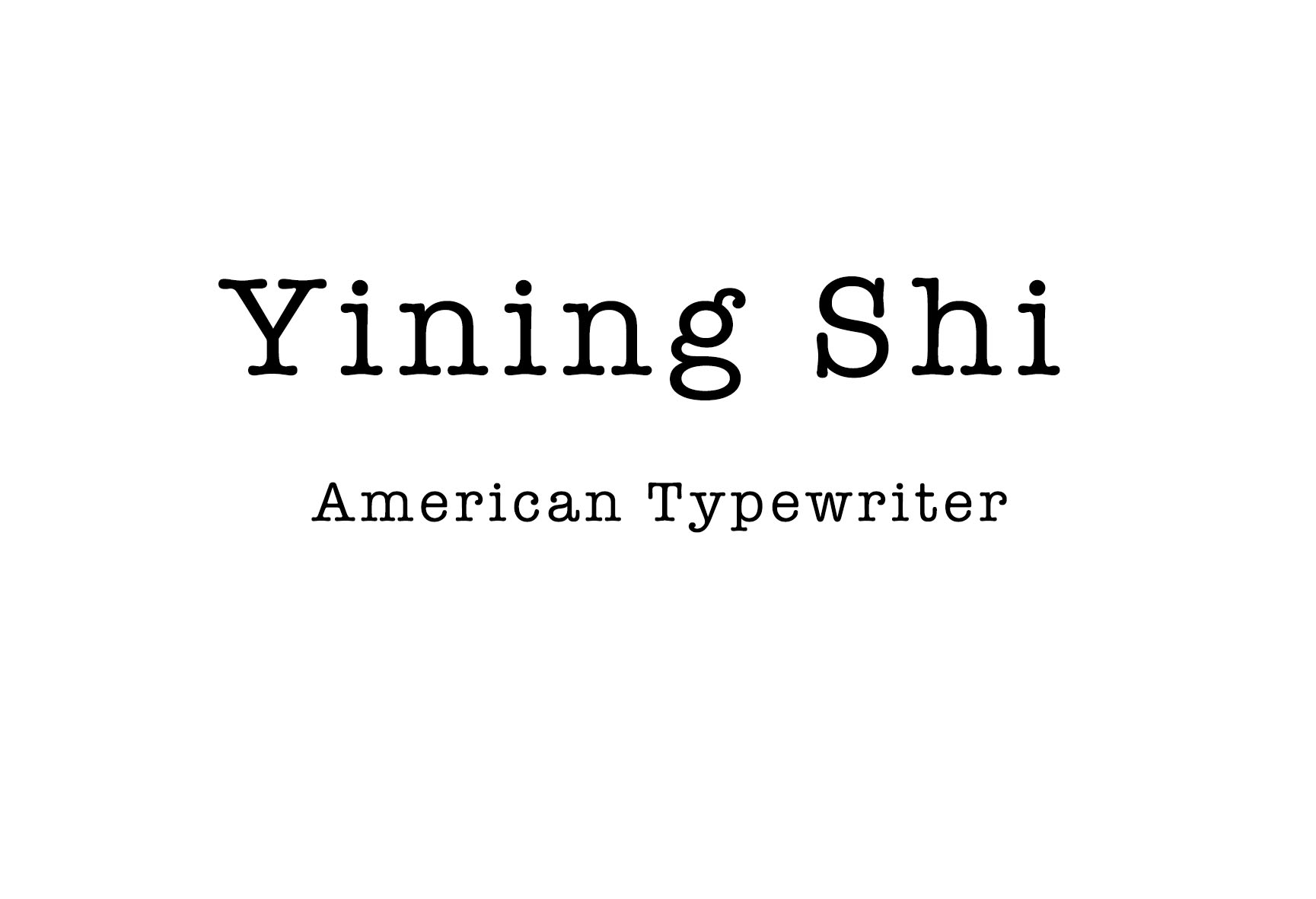
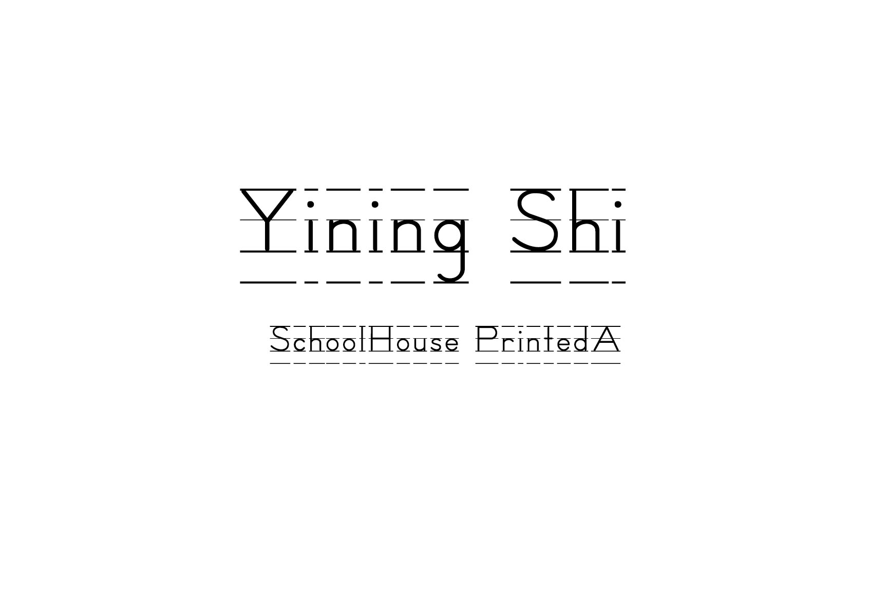
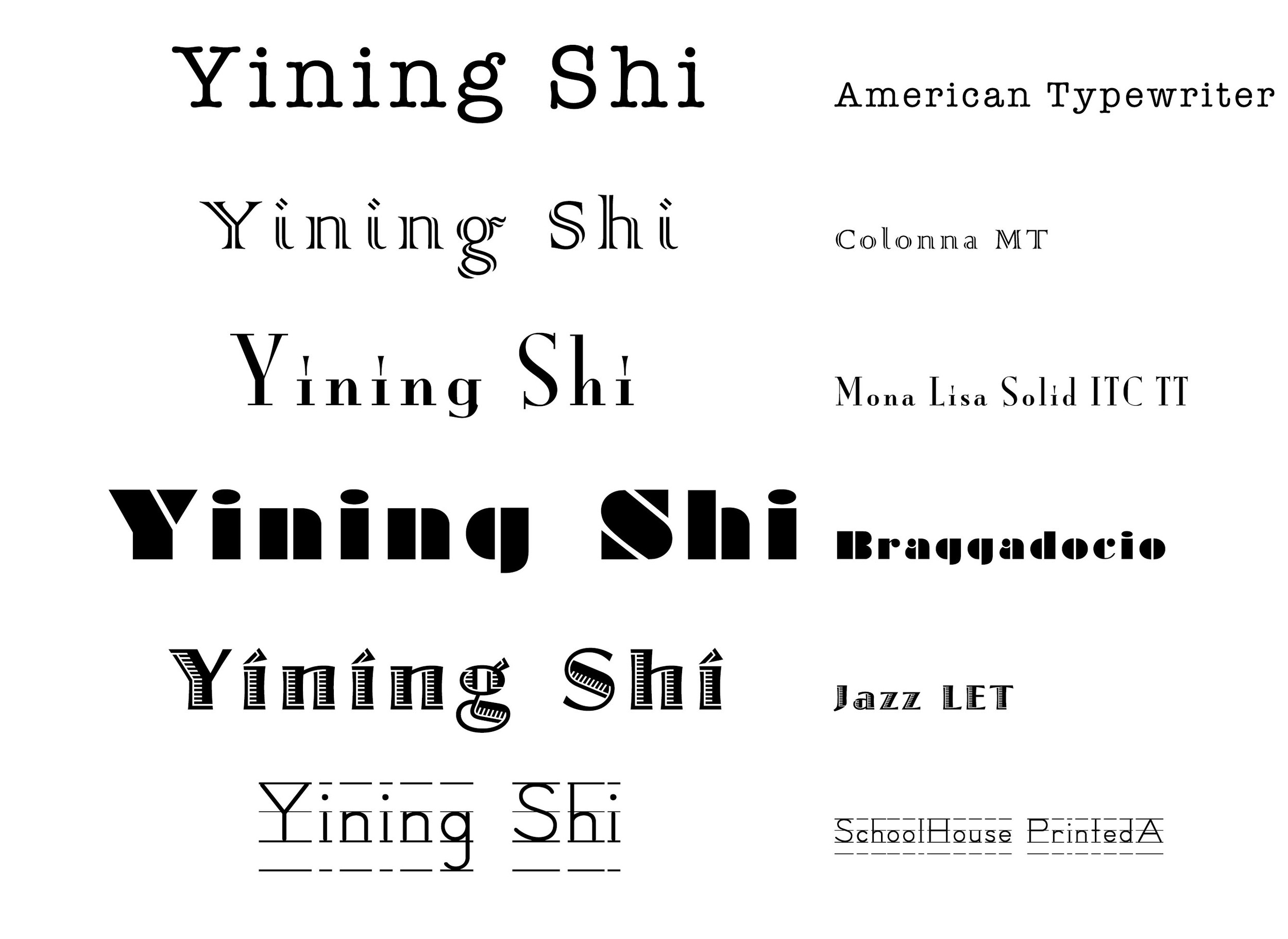 1. Every serif is so neat, especial in "yining". It's old fashioned. it imitates type writing.
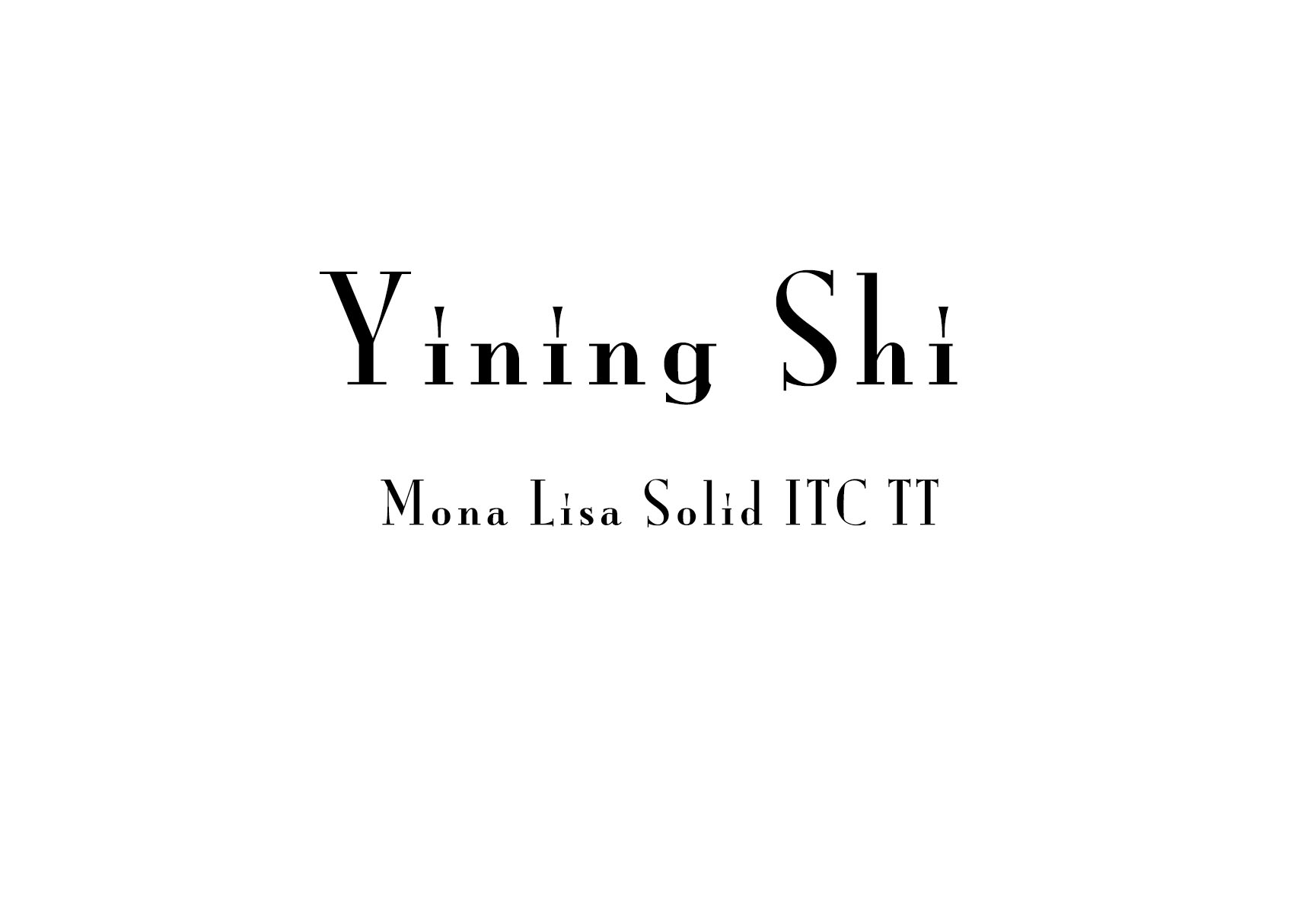
2. A roman typeface, Colonna comes with some very elegant letterforms, based on artwork obtained by Stanley Morison during 1926 as part of a program to increase the range of display faces in the Monotype library. The letters of the Colonna font have an inscriptional feel about them, figures are non-ranging. Originally developed as an advertising face, Colonna is at its best when used in large sizes

3. Big head, small body.
4. every letter is in a rectangle.
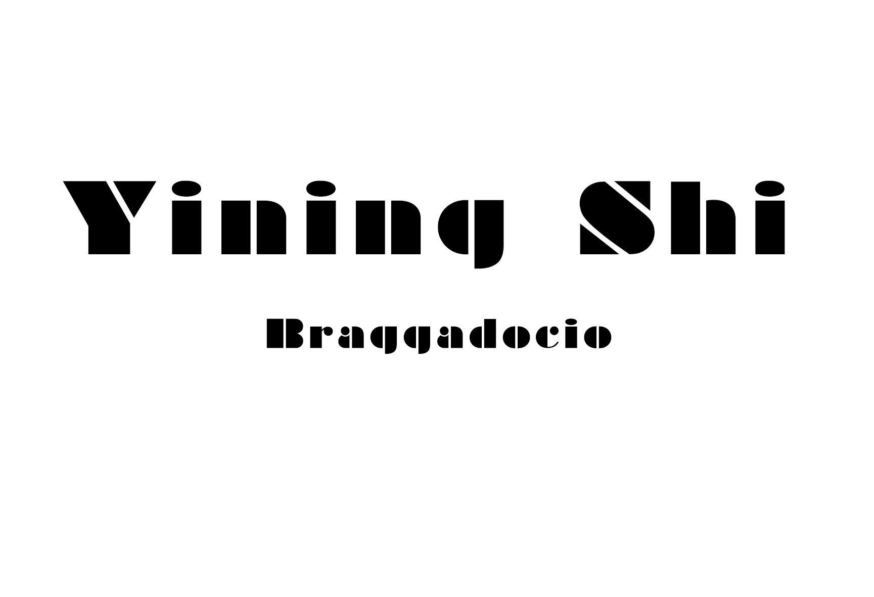
5. It looks like there's light comes from the left side.
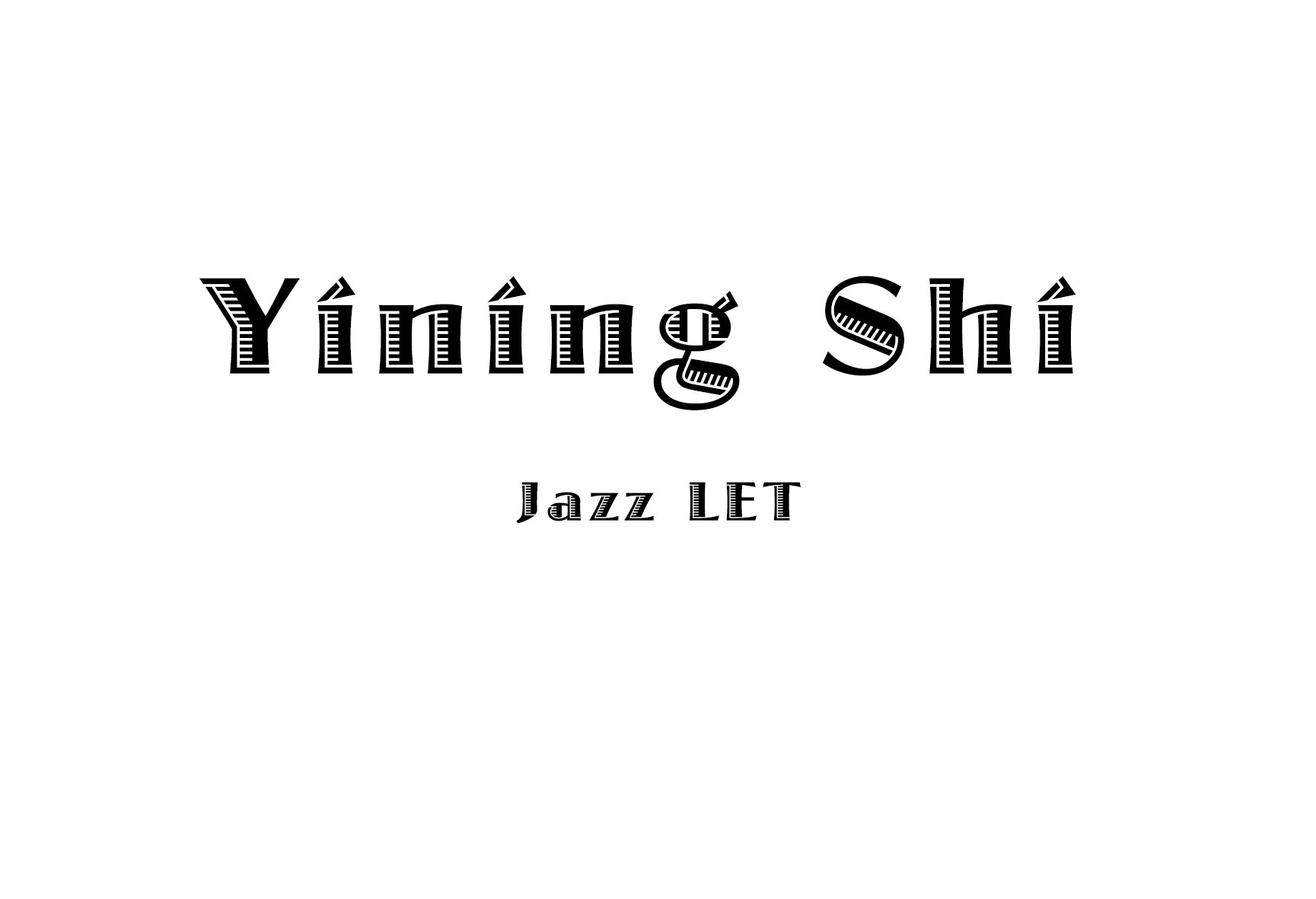
6. school style.
yining ·
This week I read "The Secret Language of Signs". And I also read "A world without Signs: will the GPS kill the sign?" because I'm interested in this topic. And after reading them, I have four thoughts to share. 1. The first article talked about the importance of signs. Because of Georgia's failure to install adequate signs, Bluffton University’s bus accident killed seven people. Before I read this, I know the signage is important, because it tells us where we are and where should we go. But this article told me this only happened when the signage works well. If the signage did not work well, in some extreme cases, like Bluffton University’s bus, the consequences can be fatal.
2、Good signage is the bridge between Google Map and our real destination.
Today we found the advent of GPS systems that makes us less dependent on the signage. Beatty, a satellite navigation specialist, believes one day we trust digital directions so completely that we no longer need signs. I don't agree with Beatty. I think good signage is the bridge between Google Map(the virtual world) and our real destination.
As a person who constantly gets lost in the New York City, I could use my "rich" wayfinding experience to prove my view. Let's say I want to find a restaurant named Sake Bar Hagi, 152 W 49th St. The first thing I do is to open Google Map. It tells me this:
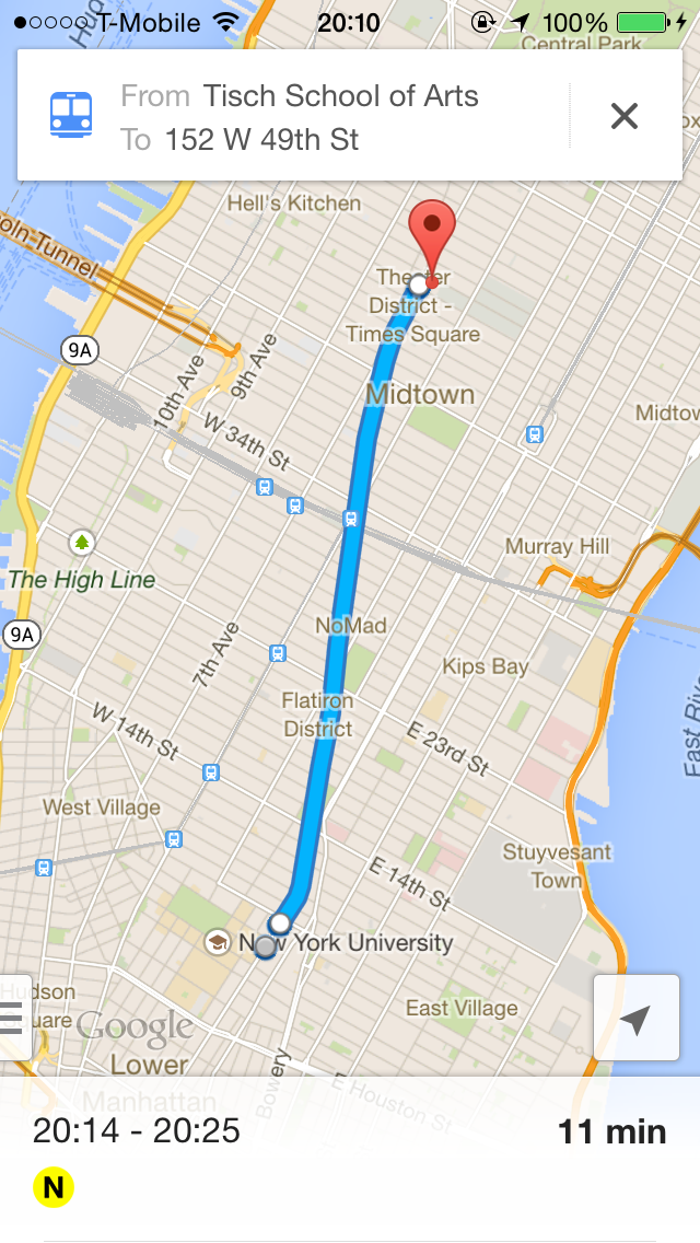
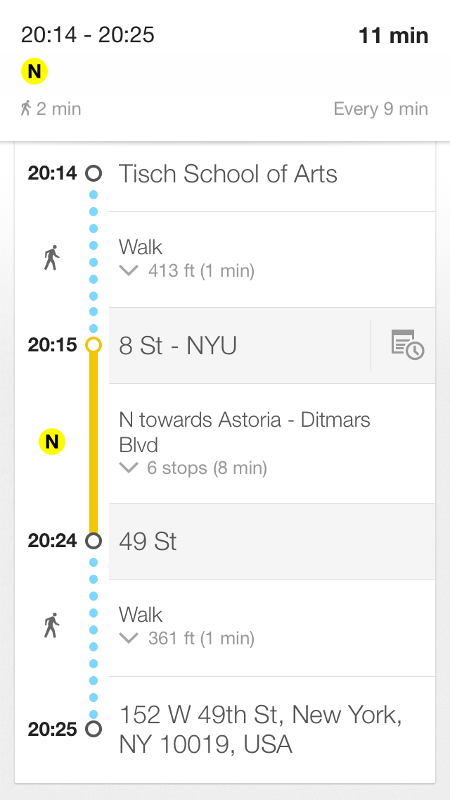
I will hold my phone and look for the signs all the way to the restaurant. The subway station and the restaurant sign is not just simply give me conformation. These signs keep me going forward to my real destination. Imaging there's no sign around the subway station, I may be failed to get into the station.
3. The article also says that security guards and secretaries were often the ones to help orient the lost. It reminds me that besides the Google Map and the signage, there's other important way we can find our way--asking other people.
My strategy to find my way is a) using the map; b) looking for the sign; c)asking other people. There's one time I used Map to find the 33rd street path station. This station hides in a mall. The Map said it was very close to me. But I just can't see it. So I asked a man. He asked me, "Can you see the M sign over there?". Unfortunately I couldn't. In the end, he walked with me to show the path station entry. So when the map and the sign failed, we have the third option. So I think there could be a new interactive tool for helping people find their ways. We can combine the signs and the map to build smart signs. You're confused with the map? You can't find the sign? That's okay, I will show you the way. I hope in the future, there would be new interactive wayfinding tools acting like human beings who offer sweet service to people.
4. Article said visitors often plan their routes online. Sometimes text on a Web site is more useful than text printed on a wall. I share the same feeling with these visitors. There's one time I would go to health examination in someplace I don't know. So I searched the Internet and found a strategy blog teaching you step by step about how to get to the place, "the elevator was on your left hand, first go to the second floor to do blood test", and so on. The author was so nice, he told you everything you should know, most situation you will encountered. And after reading this, my examination went very quickly and smoothly. So I think the advanced online information is useful and sweet.
yining ·
This week we learned about signage. Signage need to be clear, concise and intuitive. Including more than one instruction on a sign is often the reason why a sign fails. The sign I like: Pedestrian Crosswalk Sign in New York City.

I had never see this sign before I came to New York City. The pedestrian crosswalk sign I'm used to is composed of green and red lights, green means walking, red means stop. But I understand the new sign when the first time I saw it. The orange hand means stop, the walking man means walking. The sign is very figurative and intuitive. I think the new sign is better than green&red light, because if "green=walk" is not a common sense, people won't get clear and right information.
The signs can be better:
1.
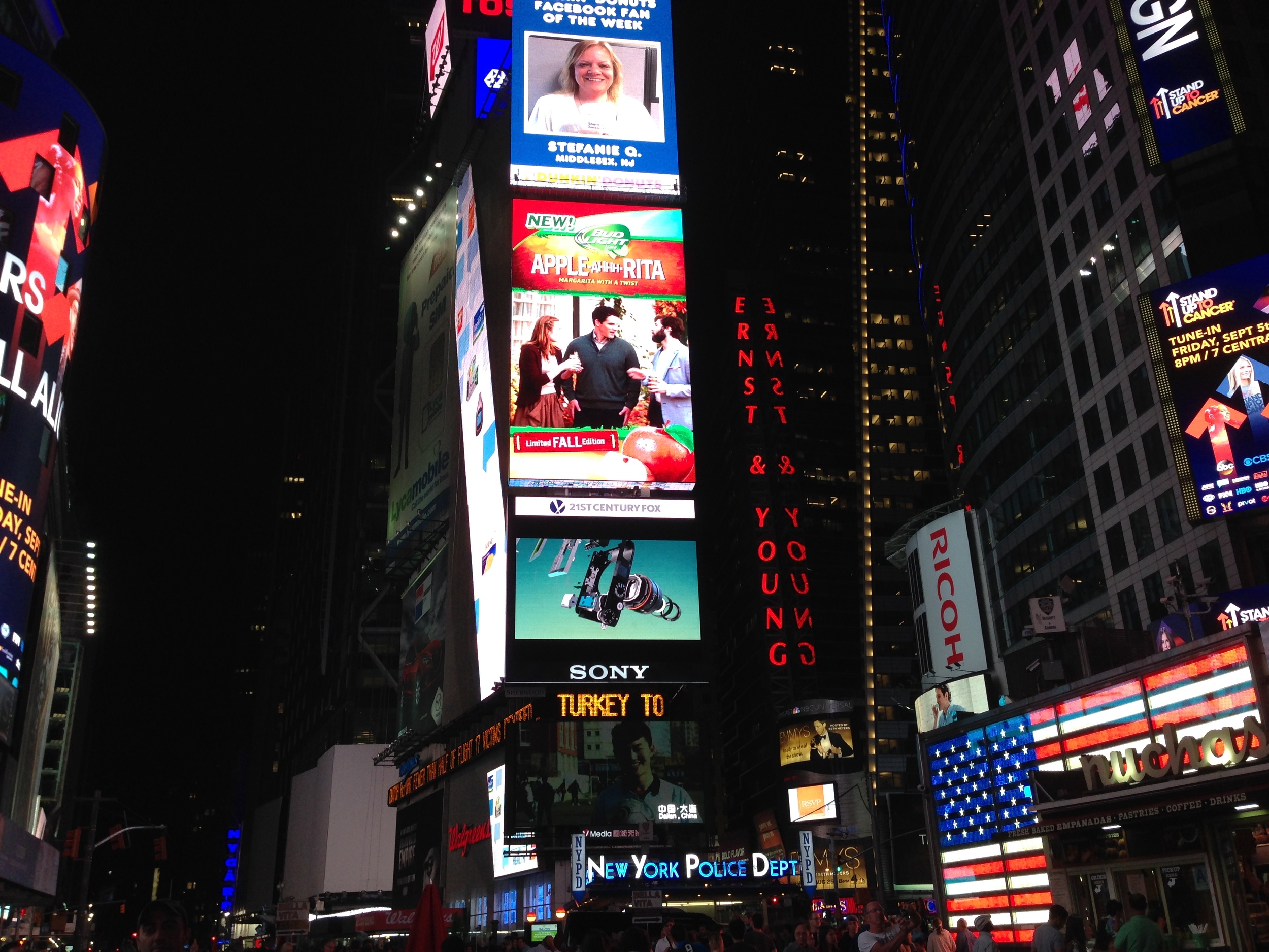

There's red sign"ERNST & YOUNG" on the right side of the picture. Because it's written in vertical, the two words are cut into serval single letters, which offer little meaning. Though the sign is in red color, it's still unreadable to me. But someone will argue there's little space for writing a sign horizontally. But I think it can be better by learning from the "MOMA" sign. It's vertical, but it's readable. I think there's three things I can learn from the MOMA sign.
(1) rotate all the letters 90 degree to the left. In this way, the letters are in vertical but they're not isolated, they're still stick together.
(2) Use legible fonts, and not all upper case.
(3)make the words short.
I think if the "ERNST & YOUNG" sign follow these rulers, it can be much better.
2.
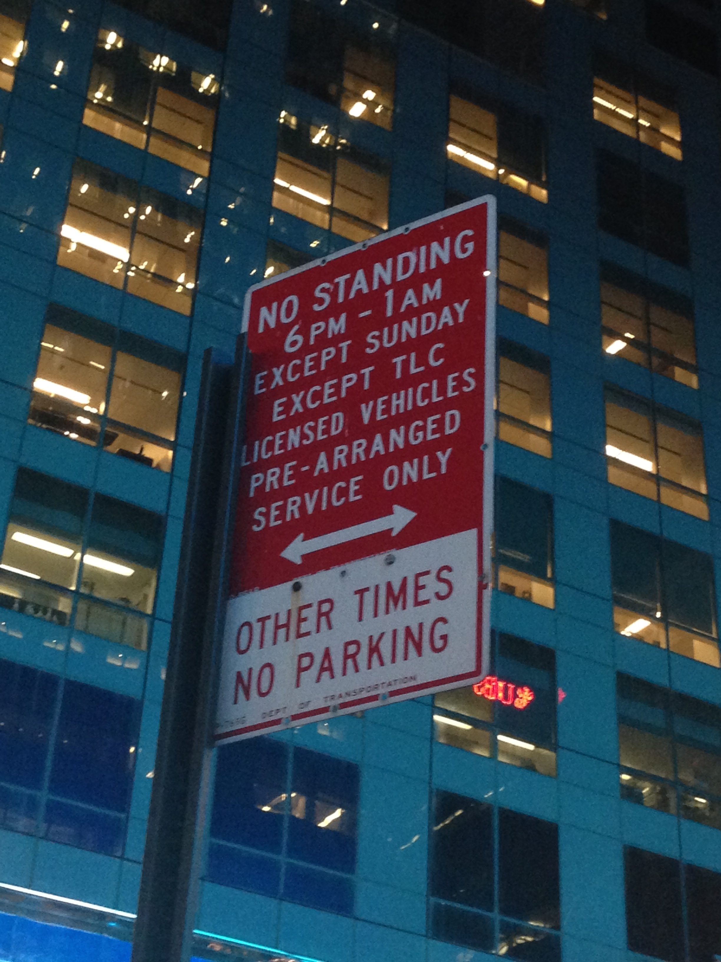
This is a parking sign on 49th st. What confuses me is "OTHER TIME". Because the time"6 PM-1 AM" is far away from "OTHER TIME". Also it uses all upper case letter, it's little unreadable. So I redesigned it.
3.

Basically, I can understand the sign says, people can leave the supermarket trolleys, especially there're some empty trolleys under the sign. But I don't understand why the trolley is tilted. When I leave a trolley, I wouldn't make it tilted.
Redesign the sign:
parking sign:

yining ·
Original image:
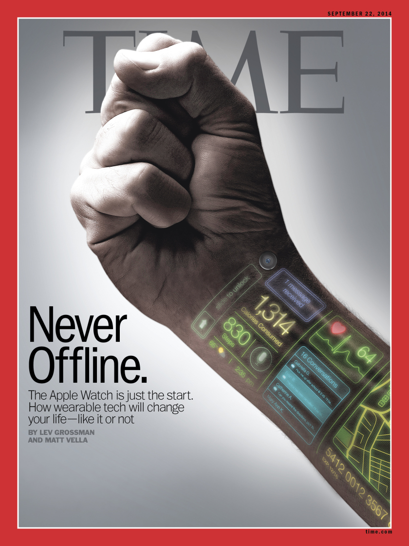 This is the cover of the latest issue of TIME magazine on sep 22, 2014. The cover makes me think about the news of the Apple Watch. Instead of simply showing readers a man wearing the Apple Watch, the designer left some digital icons on one man's wrist to tell readers much more information. The first icon is the classic unlock icon which remands me of Apple company. Other icons show the received messages, consumed calories, current weather and temperature, and the user's heartbeats. They tell us what can the new device do for us. I think the cover is a smart design, because it leaves clues to tell readers the story, where to wear the device, who designed the device, what can it do for you, not just simply showing them the product.
Also, the hand is making a fist. I think it refers that this new technology is a kind of strong force that can change everyone's life. It's also consistent with the title of this issue's main article, "how wearable tech will change your life". And I think another reason that designer don't put Apple Watch is that "the Apple Watch is just a start". There will be more fantasy device on the way.
Underlying grid:
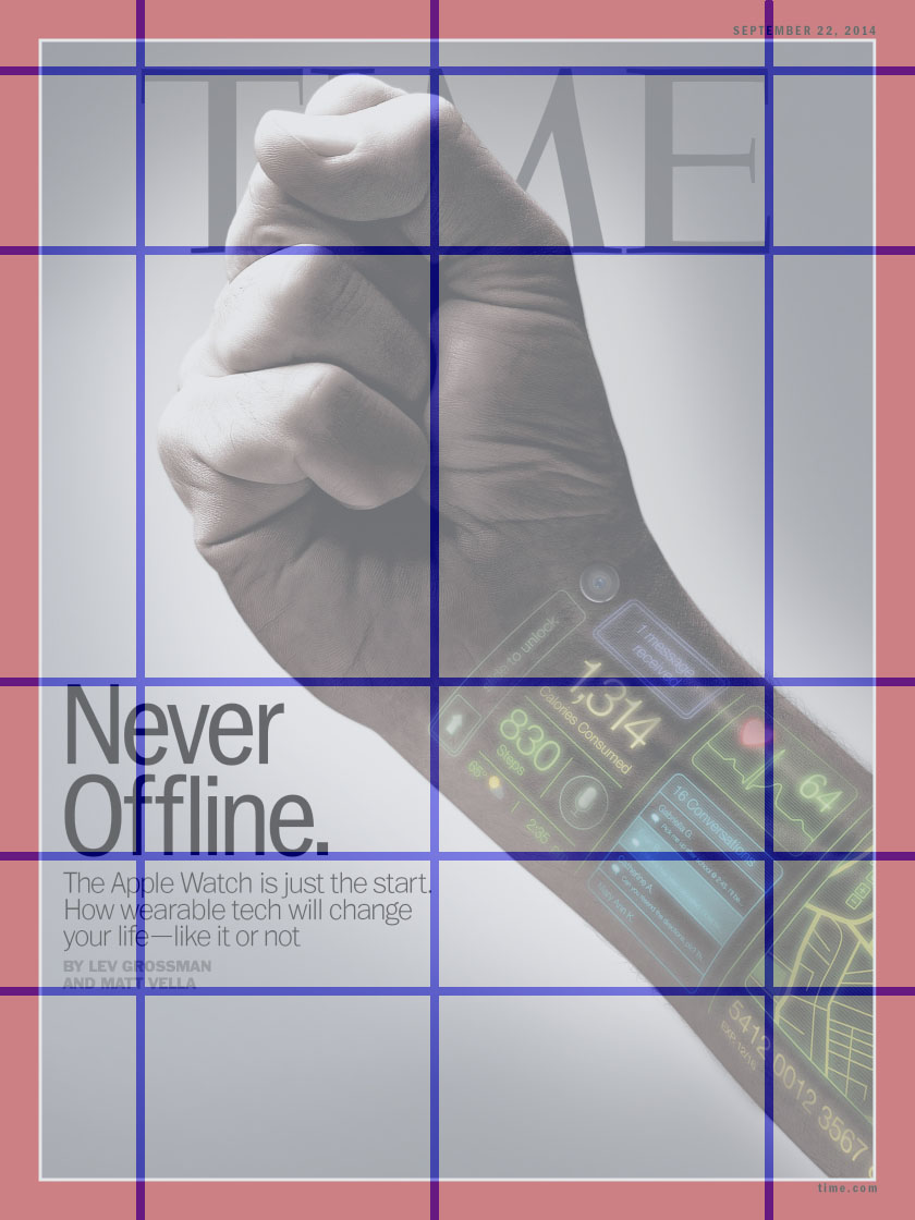 The grid is based on the fist and the texts. Horizontally, the first line is aligned with the top of "TIME" and the top of the fist. Other lines are aligned with the text. Vertically, the grid is aligned with "TIME". The title of the article is on the left side of the picture, and the fist is in the center of the picture. In addition, to me, the whole hand breaks the grid at 45 degree angle, which highlights the hand itself.
Typography:

1. "Never Offline":
The typography of the letters "Never Offline" is ITC Franklin Gothic Std Condensed, designed by Vic Caruso, from Adobe. I googled this typography and learned some background.
(This typeface is a standard choice for use in newspapers and advertising. In 1991, David Berlow completed the family for ITC by creating compressed and condensed weights. ITC Franklin Gothic Compressed is designed especially to solve impossibly tight copy fitting problems, while maintaining high legibility standards. ITC Franklin Condensed provides medium weights of narrow proportions. It is frequently seen in newspapers, advertisements, posters, and anyplace with space restrictions.)
2. "The Apple Watch is just the start."
The typography of "The Apple Watch is just the start" is Trade Gothic LT Std. Trade Gothic is similar to Franklin Gothic.
(Trade Gothic was designed by Jackson Burke between 1948 and 1960 for Linotype. In the nineteenth-century grotesque style, like News Gothic, Trade Gothic has a large x-height. Trade Gothic, with its condensed faces, is a classic design for newspaper work, particularly for headlines and classified advertising. The condensed versions increase the versatility of the typeface, particularly for setting headlines and subheads.)
3."By LEV..."
The typography of "By LEV..." is Emigre Mr Eaves XL Modern.
(It features a larger x-height than Mr Eaves Sans with shorter ascenders and descenders and overall tighter spacing. Mr Eaves XL allows for a wide variety of uses and is perfectly suitable for lengthy text settings. The larger x-height also maintains superior readability at smaller point sizes.)
The three kinds of typography have one common feature that is large x-height. And they are suitable for anyplace with space restrictions.
Color:
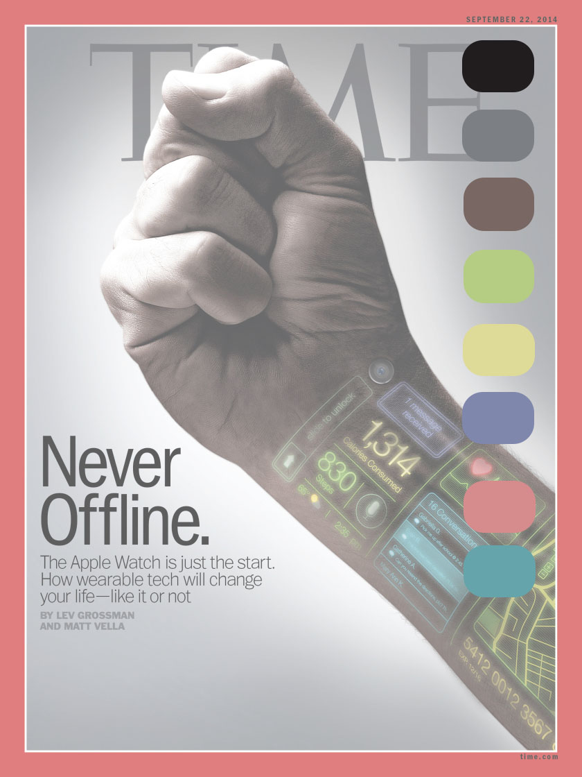
The main color are black, gray, and white. And there are five side colors. The side color express the device's rich functions.
Negative Space:

The negative space envelopes the hand and the text. And there also a white circle around the hand. In this way, reader can focus on the hand and the text near the hand.