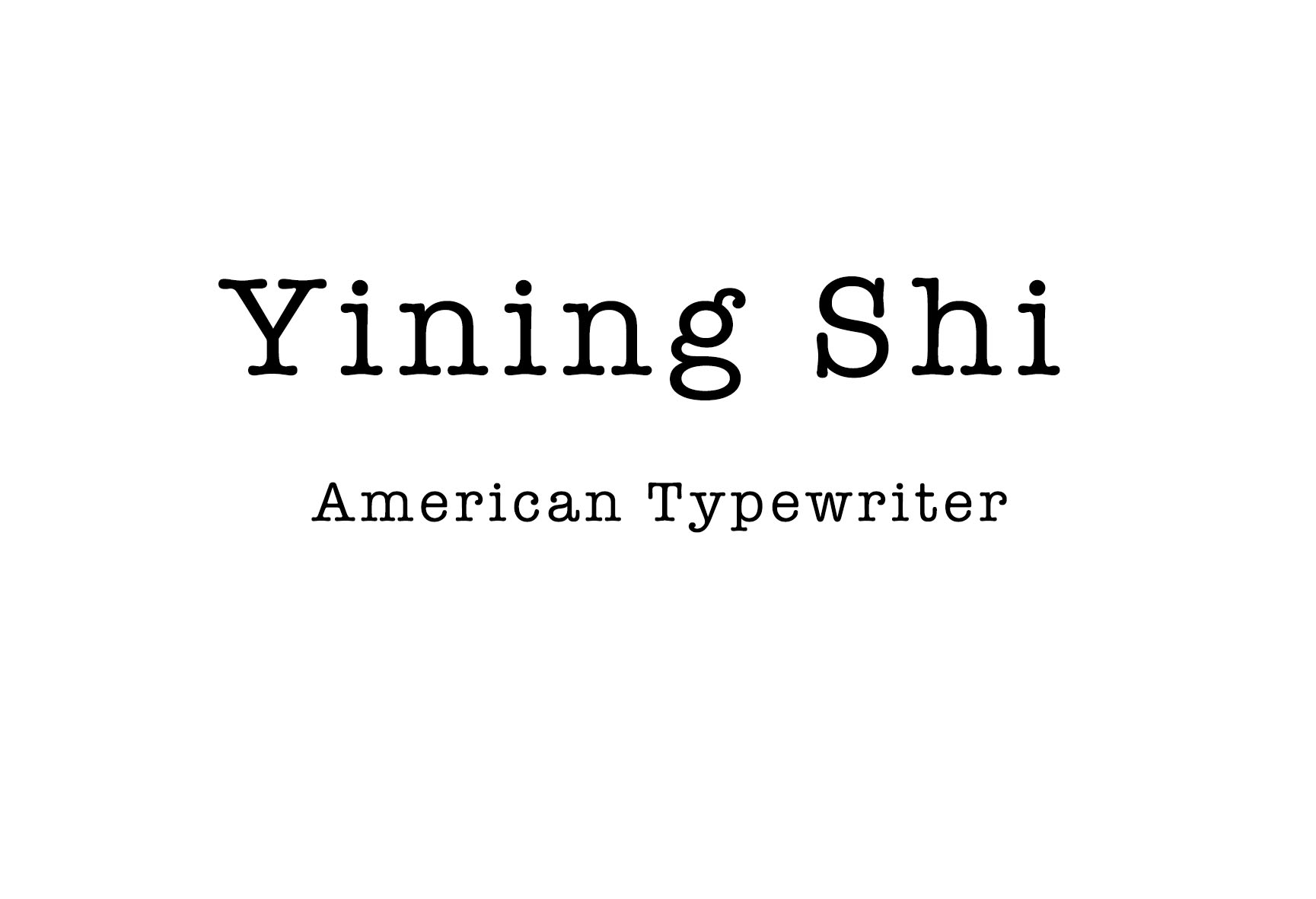
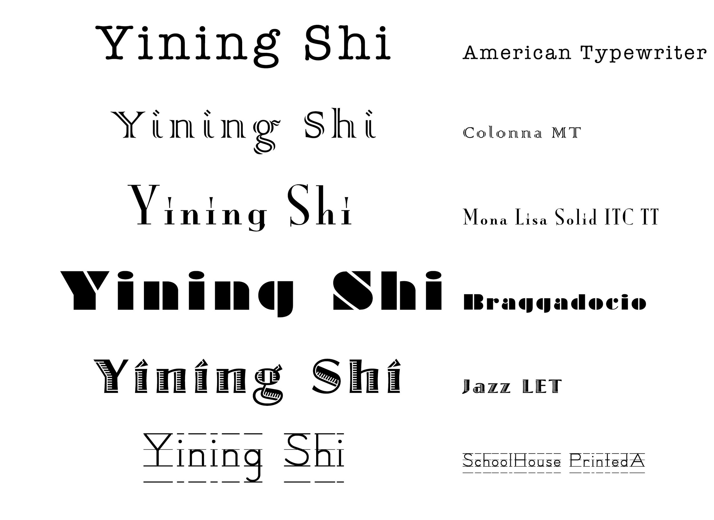
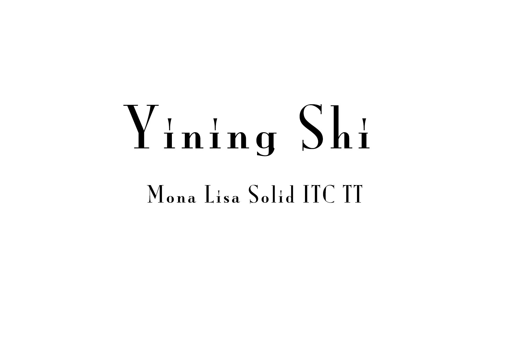
 1. Every serif is so neat, especial in "yining". It's old fashioned. it imitates type writing.
2. A roman typeface, Colonna comes with some very elegant letterforms, based on artwork obtained by Stanley Morison during 1926 as part of a program to increase the range of display faces in the Monotype library. The letters of the Colonna font have an inscriptional feel about them, figures are non-ranging. Originally developed as an advertising face, Colonna is at its best when used in large sizes
3. Big head, small body.
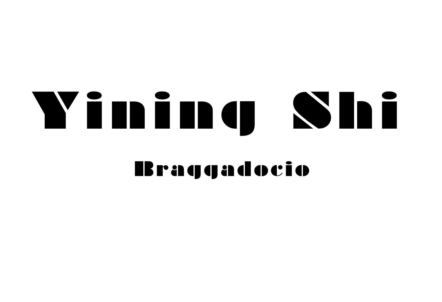
4. every letter is in a rectangle.
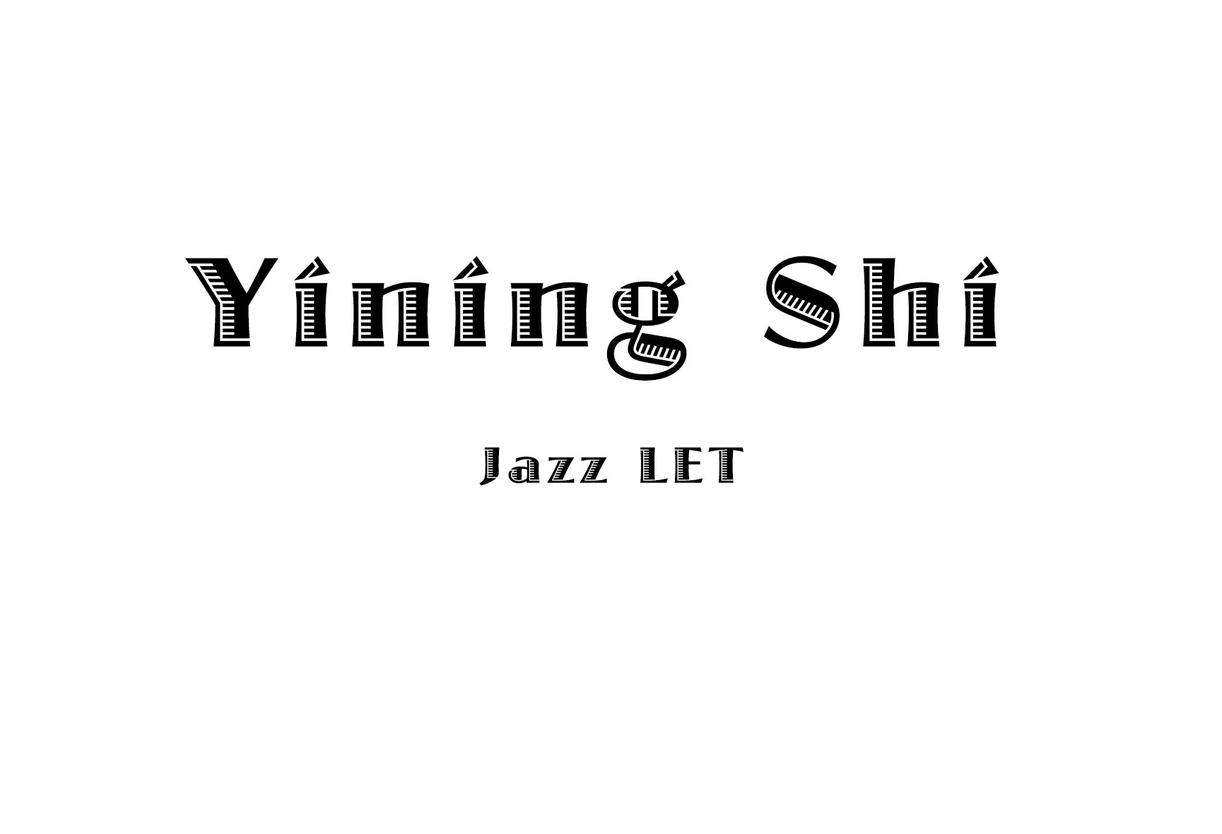
5. It looks like there's light comes from the left side.
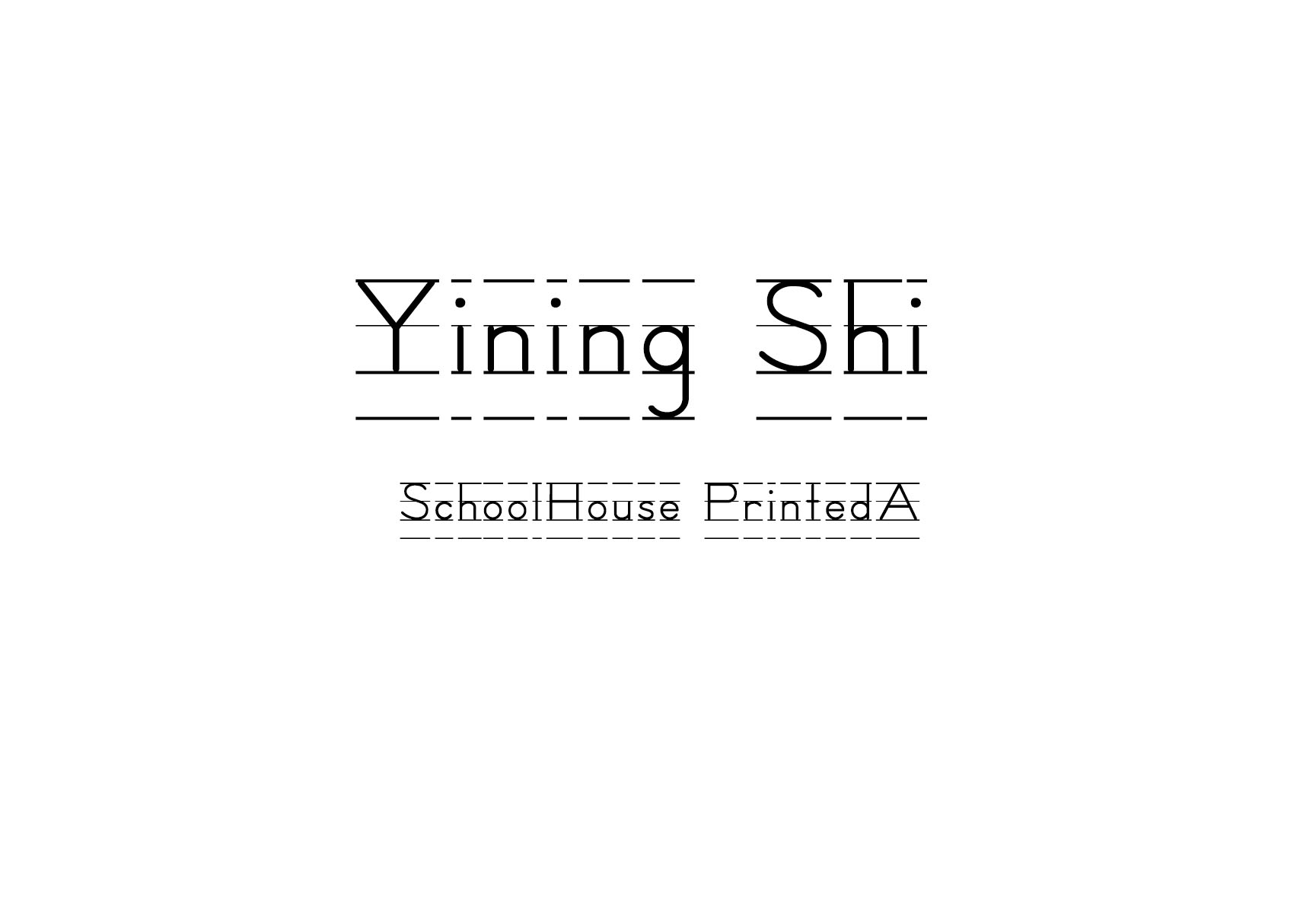
6. school style.
