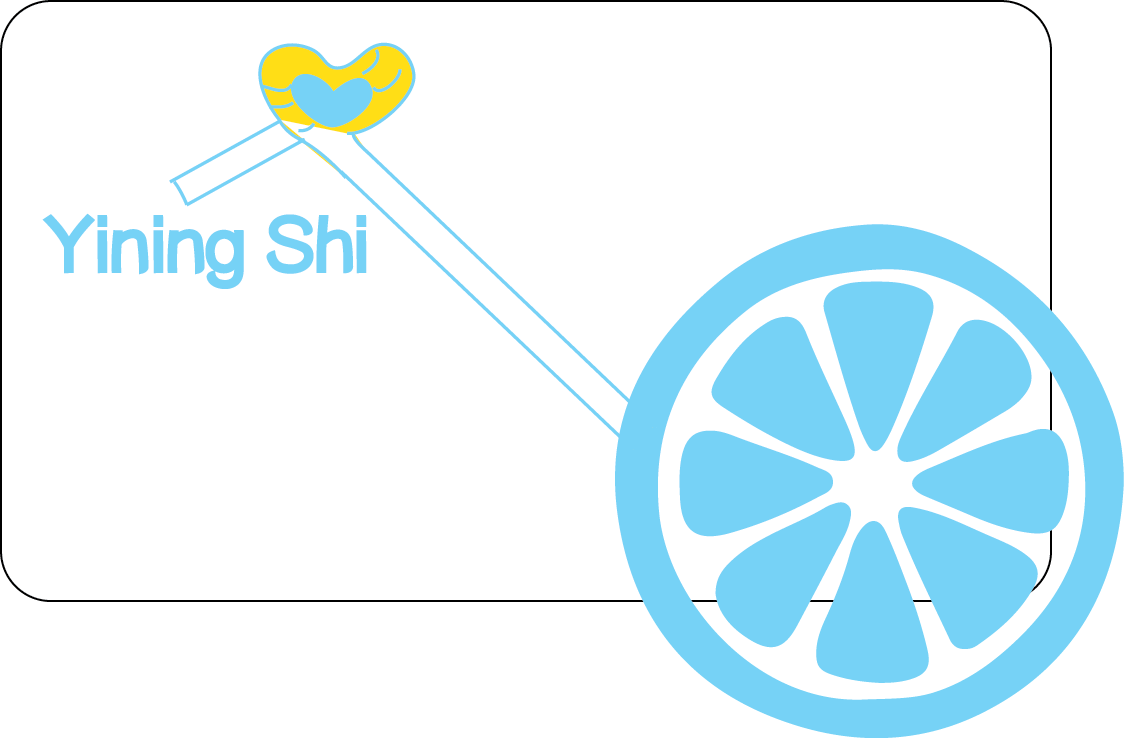
This is my business card. Because my name means lemon, so I decided to use lemon as a logo. I used the color of lemon: yellow and its contrast color: blue.
Also I designed a drinking straw connecting my name and the lemon. I
used the golden ratio to arrange my email address.
I chose this typography because it's simple, neat and a little cute. I think it can show some of my personality. I also made all my informations align to each other.
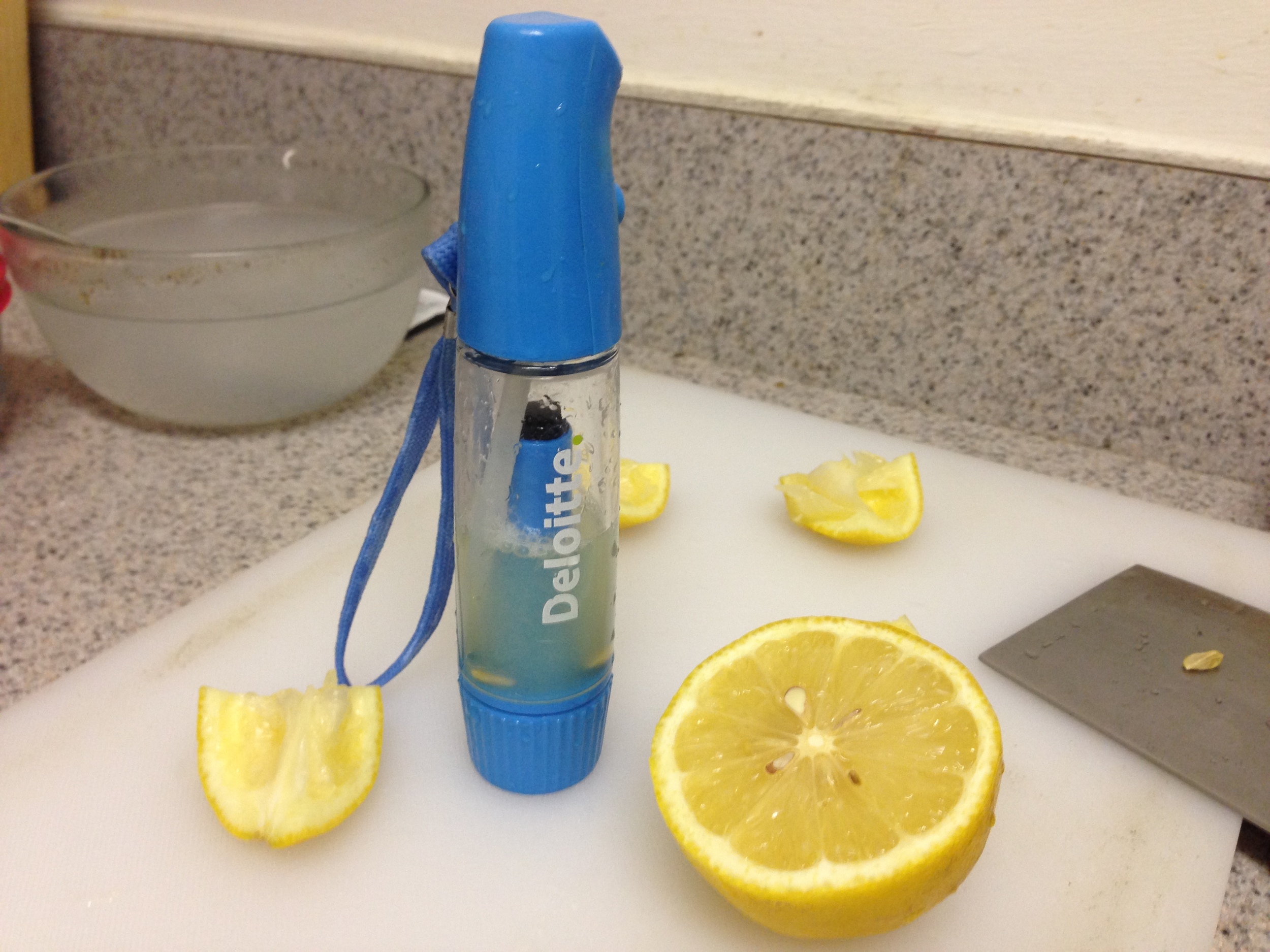
I also want my business card be more special, I sprayed some lemonade to the card, hope it can help people remember me when people smelled the lemonade. But I made a mistake. The lemonade wouldn't volatilize, so people can't smell the lemon, I will use lemon perfume in the future.
Another mistake is that I didn't make the front side and the back side suit each other. I will make it right in the future.
In addition, I used round corners rectangle for the shape of the card, to express a gentle feeling and protect people's fingers from getting hurt.