1) Awesome logos
A little history:
The Chanel logo design was designed in 1925 by Coco Chanel herself and remained unchanged ever since. It turned out to be one of the most recognizable symbols in the fashion world with its overlapping double 'C' - one facing forward and the other facing backward. Chanel's logo is frequently seen in perfumes, purses, shoes, and jewelry.
The first reason I like this logo is that the composition is balanced. It's vertically and horizontally symmetrical. It's simple and elegant.
The second thing is the colors of this Logo. The black and white are the main colors of Chanel's clothes. The black is the essential of everything, and it reveals women's radius. Chanel made black as the color of elegance by designing little black dress in 1926. And the color white, the beginning is the white. It captures all the light, it illuminates the face and enhances beauty. I love the two colors, they are simple, elegant and represent the brand.
2) Create the ITP Logo
The logo I created for ITP is simple, it focuses on one single meaning:
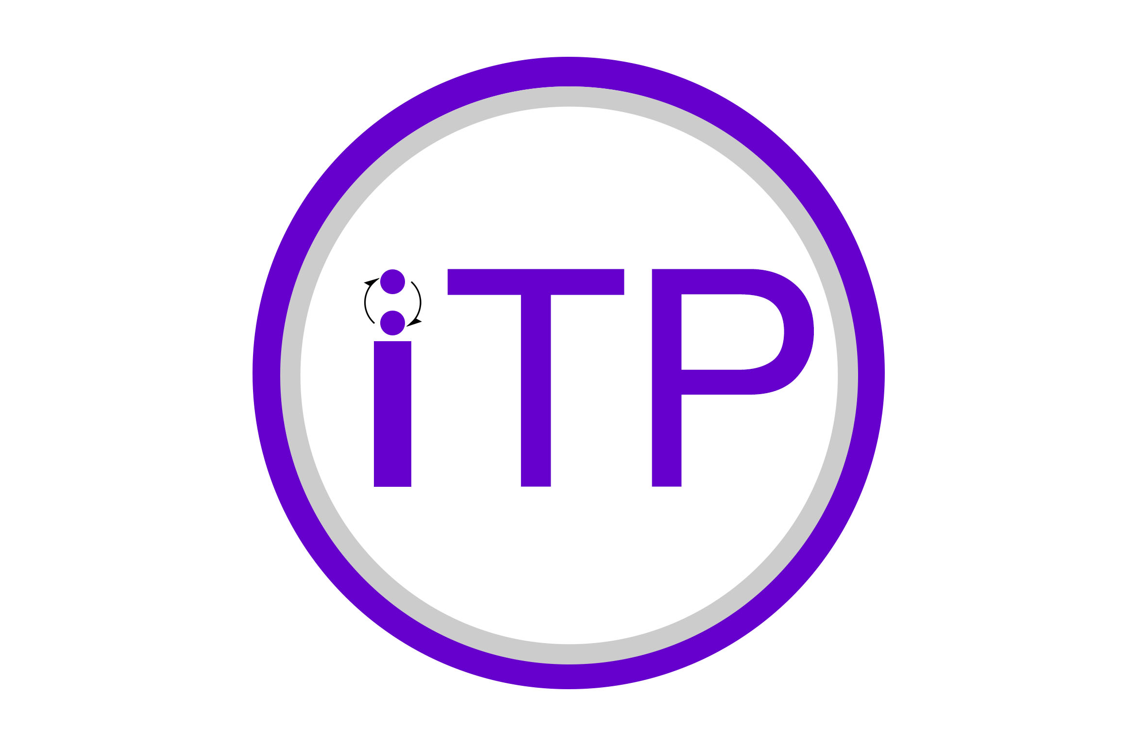
The idea comes from that ITP's work is to promote interaction. The definition of interaction is a loop, is about two people constantly speaking, thinking and listening to each other. So I drew two circles representing two people, and two arrows representing the loop of conversation.
Also, the color is purple, since we are a part of NYU.
I made various sketches. First, I want to express the meaning of "new possibility" or "digital media", but they can't express the meaning very well. I also want to add mouth and ear on the circle to fully express the meaning of listening and speaking, but I'm not sure it's a good idea, cause logos should be simple and abstract. Actually, I'm confused about how simple a piece of design should be. Most of time, people say, keep it simple, don't put too much on your design, otherwise you may ruin it. But sometimes, I was also worried that it's too simple, it can't support the idea behind it.


