Original image:
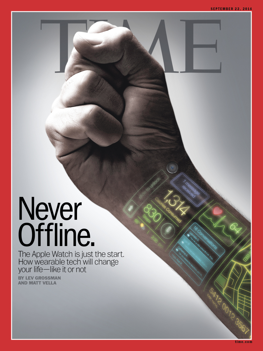 This is the cover of the latest issue of TIME magazine on sep 22, 2014. The cover makes me think about the news of the Apple Watch. Instead of simply showing readers a man wearing the Apple Watch, the designer left some digital icons on one man's wrist to tell readers much more information. The first icon is the classic unlock icon which remands me of Apple company. Other icons show the received messages, consumed calories, current weather and temperature, and the user's heartbeats. They tell us what can the new device do for us. I think the cover is a smart design, because it leaves clues to tell readers the story, where to wear the device, who designed the device, what can it do for you, not just simply showing them the product.
Also, the hand is making a fist. I think it refers that this new technology is a kind of strong force that can change everyone's life. It's also consistent with the title of this issue's main article, "how wearable tech will change your life". And I think another reason that designer don't put Apple Watch is that "the Apple Watch is just a start". There will be more fantasy device on the way.
Underlying grid:
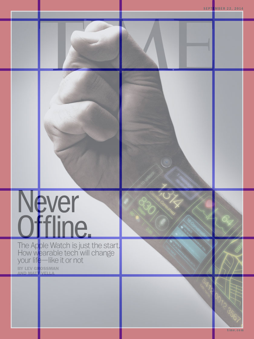 The grid is based on the fist and the texts. Horizontally, the first line is aligned with the top of "TIME" and the top of the fist. Other lines are aligned with the text. Vertically, the grid is aligned with "TIME". The title of the article is on the left side of the picture, and the fist is in the center of the picture. In addition, to me, the whole hand breaks the grid at 45 degree angle, which highlights the hand itself.
Typography:

1. "Never Offline":
The typography of the letters "Never Offline" is ITC Franklin Gothic Std Condensed, designed by Vic Caruso, from Adobe. I googled this typography and learned some background.
(This typeface is a standard choice for use in newspapers and advertising. In 1991, David Berlow completed the family for ITC by creating compressed and condensed weights. ITC Franklin Gothic Compressed is designed especially to solve impossibly tight copy fitting problems, while maintaining high legibility standards. ITC Franklin Condensed provides medium weights of narrow proportions. It is frequently seen in newspapers, advertisements, posters, and anyplace with space restrictions.)
2. "The Apple Watch is just the start."
The typography of "The Apple Watch is just the start" is Trade Gothic LT Std. Trade Gothic is similar to Franklin Gothic.
(Trade Gothic was designed by Jackson Burke between 1948 and 1960 for Linotype. In the nineteenth-century grotesque style, like News Gothic, Trade Gothic has a large x-height. Trade Gothic, with its condensed faces, is a classic design for newspaper work, particularly for headlines and classified advertising. The condensed versions increase the versatility of the typeface, particularly for setting headlines and subheads.)
3."By LEV..."
The typography of "By LEV..." is Emigre Mr Eaves XL Modern.
(It features a larger x-height than Mr Eaves Sans with shorter ascenders and descenders and overall tighter spacing. Mr Eaves XL allows for a wide variety of uses and is perfectly suitable for lengthy text settings. The larger x-height also maintains superior readability at smaller point sizes.)
The three kinds of typography have one common feature that is large x-height. And they are suitable for anyplace with space restrictions.
Color:
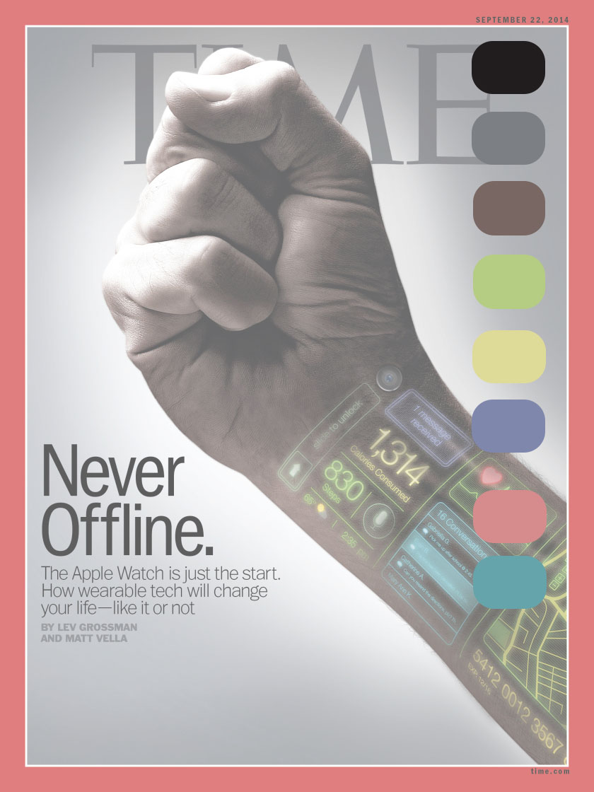
The main color are black, gray, and white. And there are five side colors. The side color express the device's rich functions.
Negative Space:

The negative space envelopes the hand and the text. And there also a white circle around the hand. In this way, reader can focus on the hand and the text near the hand.