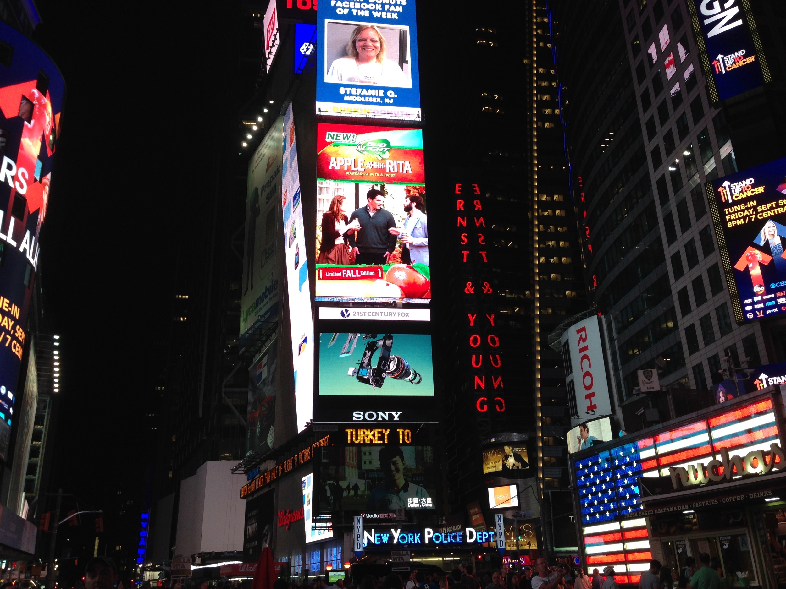
This week we learned about signage. Signage need to be clear, concise and intuitive. Including more than one instruction on a sign is often the reason why a sign fails. The sign I like: Pedestrian Crosswalk Sign in New York City.
I had never see this sign before I came to New York City. The pedestrian crosswalk sign I'm used to is composed of green and red lights, green means walking, red means stop. But I understand the new sign when the first time I saw it. The orange hand means stop, the walking man means walking. The sign is very figurative and intuitive. I think the new sign is better than green&red light, because if "green=walk" is not a common sense, people won't get clear and right information.
The signs can be better:
1.
There's red sign"ERNST & YOUNG" on the right side of the picture. Because it's written in vertical, the two words are cut into serval single letters, which offer little meaning. Though the sign is in red color, it's still unreadable to me. But someone will argue there's little space for writing a sign horizontally. But I think it can be better by learning from the "MOMA" sign. It's vertical, but it's readable. I think there's three things I can learn from the MOMA sign.
(1) rotate all the letters 90 degree to the left. In this way, the letters are in vertical but they're not isolated, they're still stick together.
(2) Use legible fonts, and not all upper case.
(3)make the words short.
I think if the "ERNST & YOUNG" sign follow these rulers, it can be much better.
2.
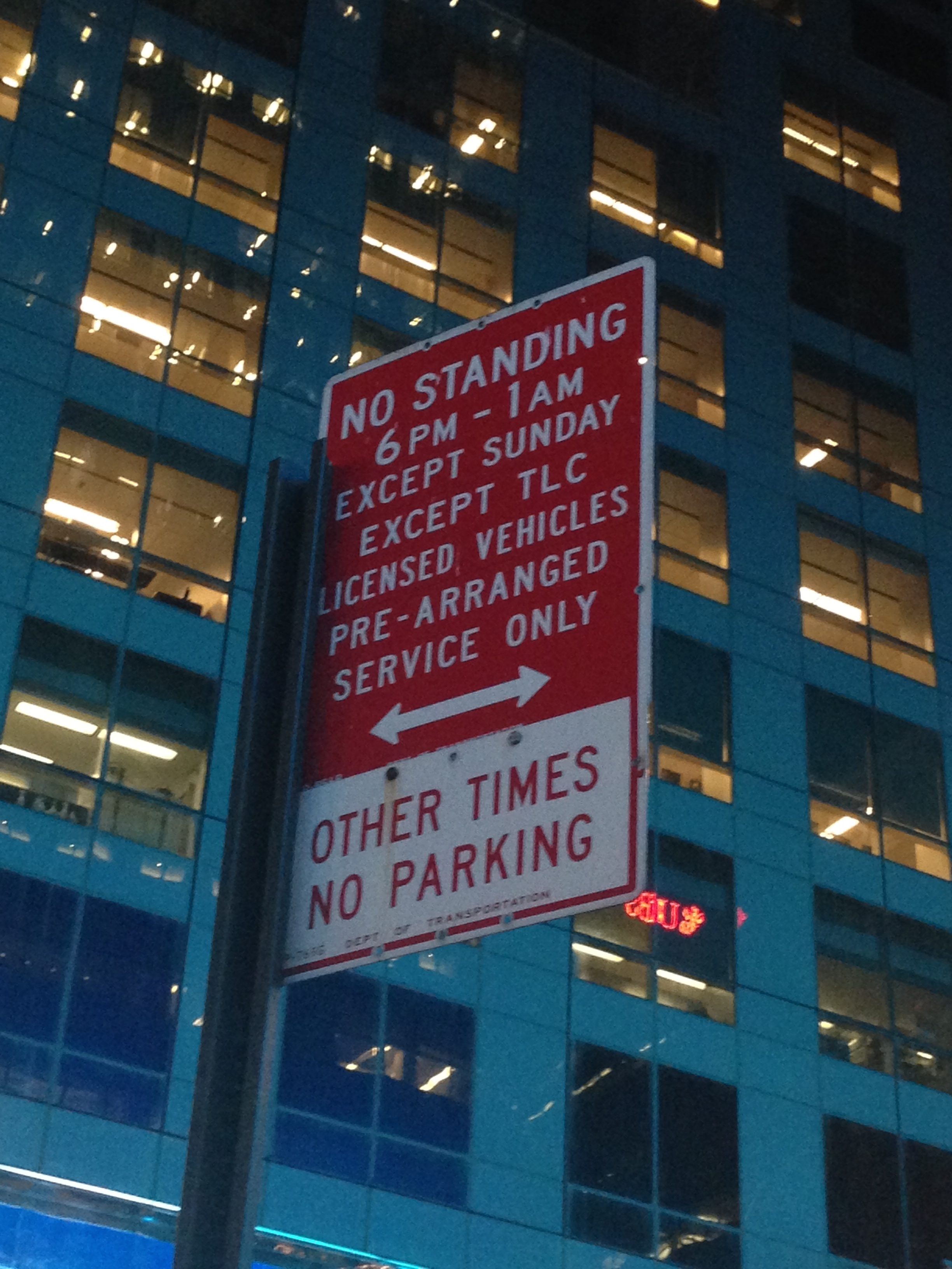
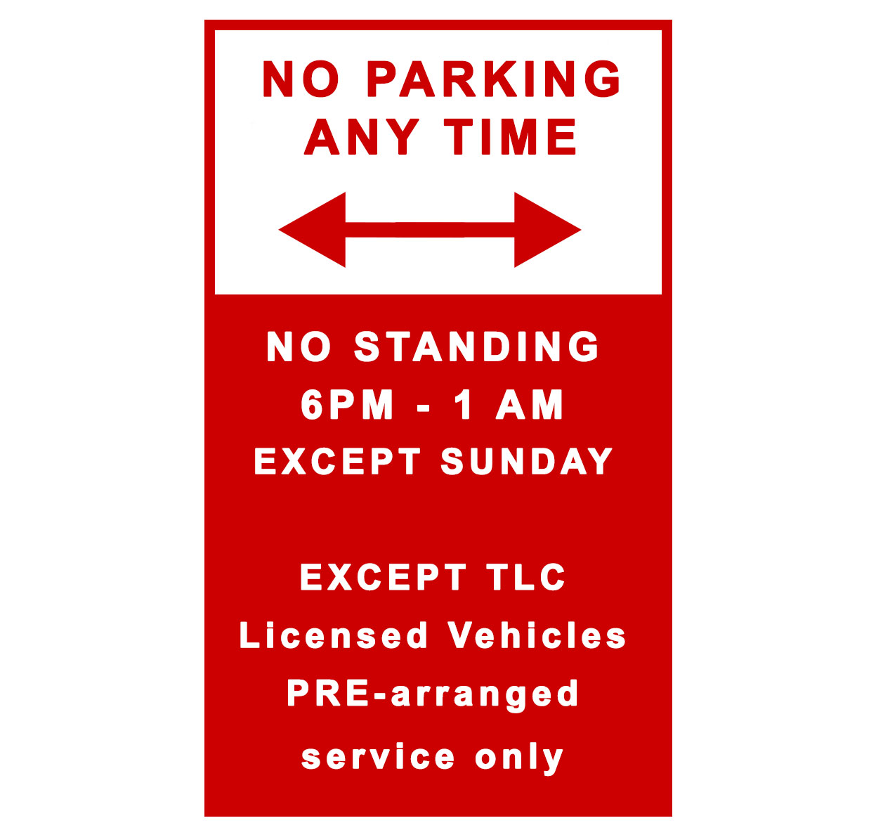
This is a parking sign on 49th st. What confuses me is "OTHER TIME". Because the time"6 PM-1 AM" is far away from "OTHER TIME". Also it uses all upper case letter, it's little unreadable. So I redesigned it.
3.
Basically, I can understand the sign says, people can leave the supermarket trolleys, especially there're some empty trolleys under the sign. But I don't understand why the trolley is tilted. When I leave a trolley, I wouldn't make it tilted.
Redesign the sign:
parking sign:


