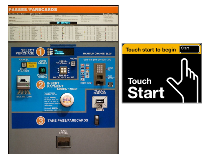
This week I picked the subway Ticket Vending Machine in New York City as my observation object. The reason I started to pay attention to the Ticket Vending Machine is that this is designed by a ITP graduate. The old Ticket Vending Machine interface is very, very confusing. People don't know how to start with. But the new interface is very simple. Everything starts with the "start" button, and users can go though the whole process by making choice on the screen. The picture below is about the old and new interface.

This is the interface of the Ticket Vending Machine. There's a good design idea about the new machine. The designer uses color in purpose. The green region is where the green money goes. The yellow region is where the yellow Metro card goes. And the blue region is for credit cards which are most is blue. I think the matching color instinct can help users, even many users don't realize the design idea behind this.
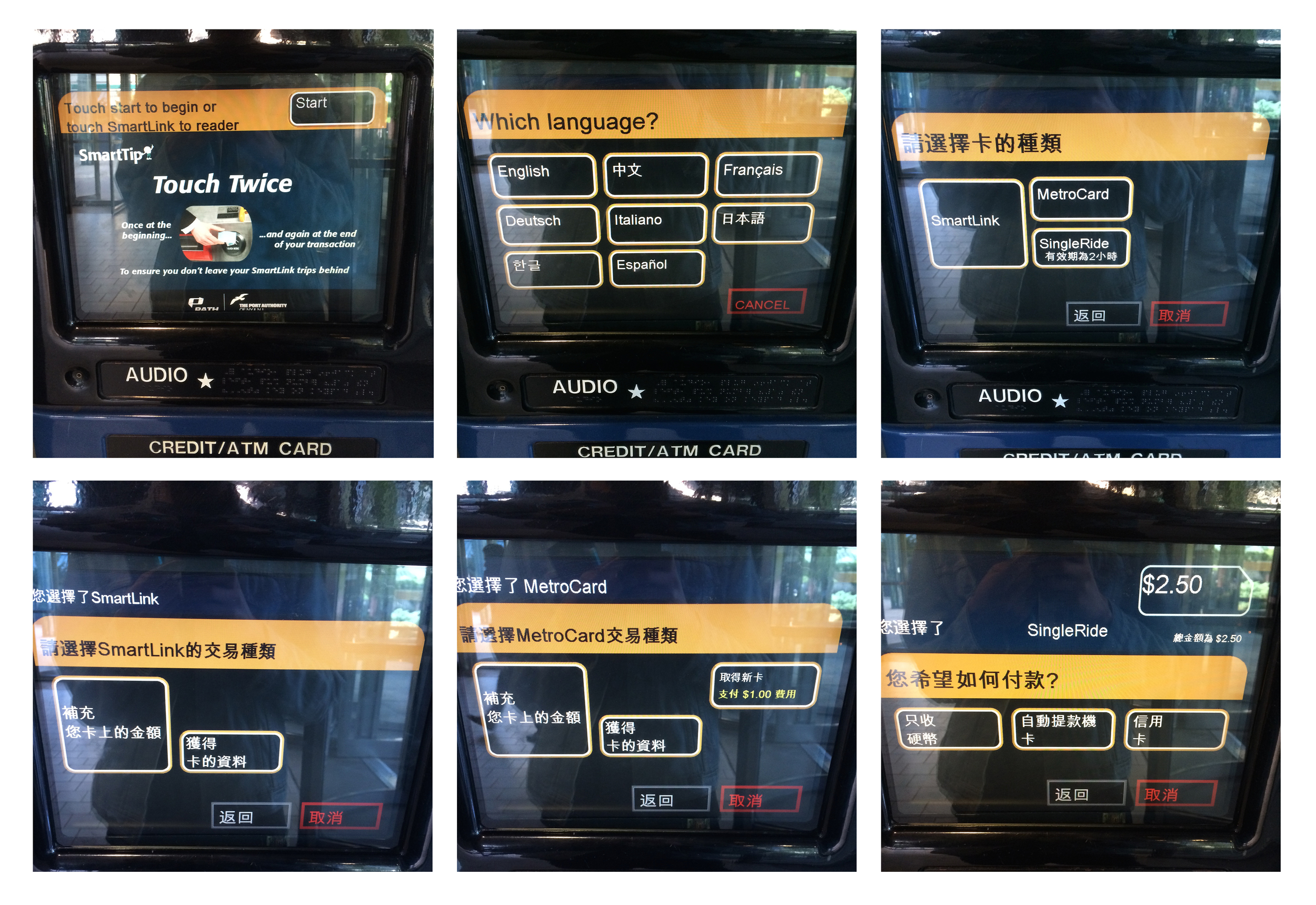
I think another cleverness about the new design is that instead of showing users the whole function the machine can do, it hide the confusing details to the users, and simply leave clear clues to the users, so that different users can get what they want and do not need know other functions. The new interface has a clear brach logic to help user go though the process, like the picture showed below.
Here are steps for me to use the machine to fill my smartlink card (A type of card for people to take Path train unlimitedly in a month).
- First step: click "start" button;
- Second step: choose a language;
- Third step: choose the type of the card;
- Fourth step: choose the type of service(fill the card/look the information of the card)
- Fifth step: put your card in the right place and take it back
- Sixth step: choose the payment method
- Seventh step: dip your debit card/insert the cash
- Eighth step: confirm the payment.
Ok! I said a lot good words about the machine, it's time to complain about its certain features. :P
difficulties and the easy parts:
When the first time I used this machine to fill my card, I encounter a little bit serious problem -- I can't dip my debit card to make a successful transition. Maybe I dip the card too fast or too slow, I tried four times in total to make the payment. My chase account appears four times payments, and my card was only filled once. So apparently, the machine can recognize my card at each time, if not, my chase account would't report the transition. So this is a problem should be fixed.
The easy part is to touch the "start" button and make choice at each stage to go through the process.
Time:
I observed the people who using the machine in the 9th St Path station on sept. 22nd. I saw 6 people used the machine. Three of them seem familiar with the machine. They bought the ticket within 1:30 minutes. And for the rest of people, their action were much more slow. They hesitated about the information on the screen. One person looked around and wanted to ask for some help. And I came to help her, she couldn't insert cash successfully. I didn't know what to do either. So she used her credit card. So it seems to me that the most difficulties happens when users make the payment. Other parts are just making choice on the screen, which should be east for most people.
After reading Crawford and Norman's article, I became more aware of the importance of usability. Well-designed objects are very easy to interpret and understand. So I like the new Ticket Vending Machine that hide the technical details from users and make the process easy to use and understand.


