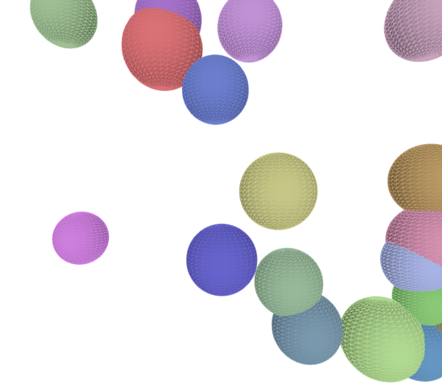
This week, I used PVector to replace the location, velocity and the accelerator. I add gravity, wind and friction to the objects. I changed the object into sphere, because I like the weird way when they overlapped to each other.
Introduction to Computer Media
yining ·
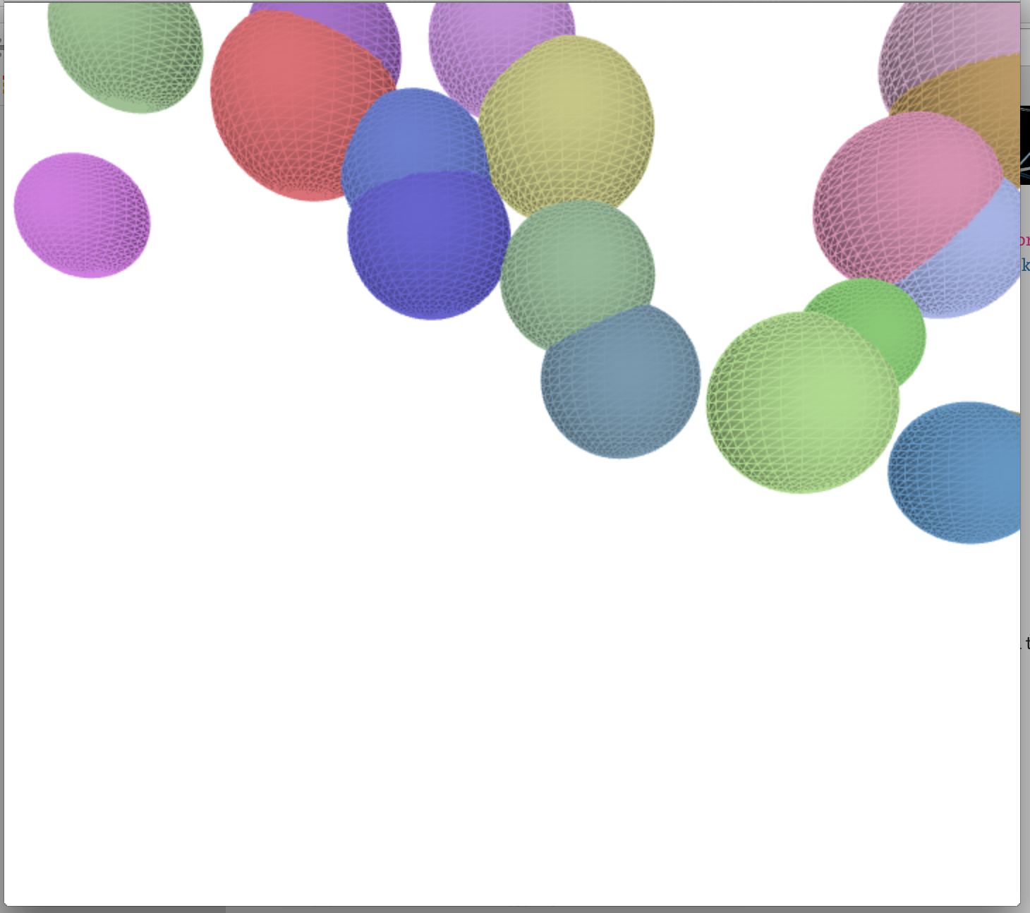
This week, I used PVector to replace the location, velocity and the accelerator. I add gravity, wind and friction to the objects. I changed the object into sphere, because I like the weird way when they overlapped to each other.
yining ·
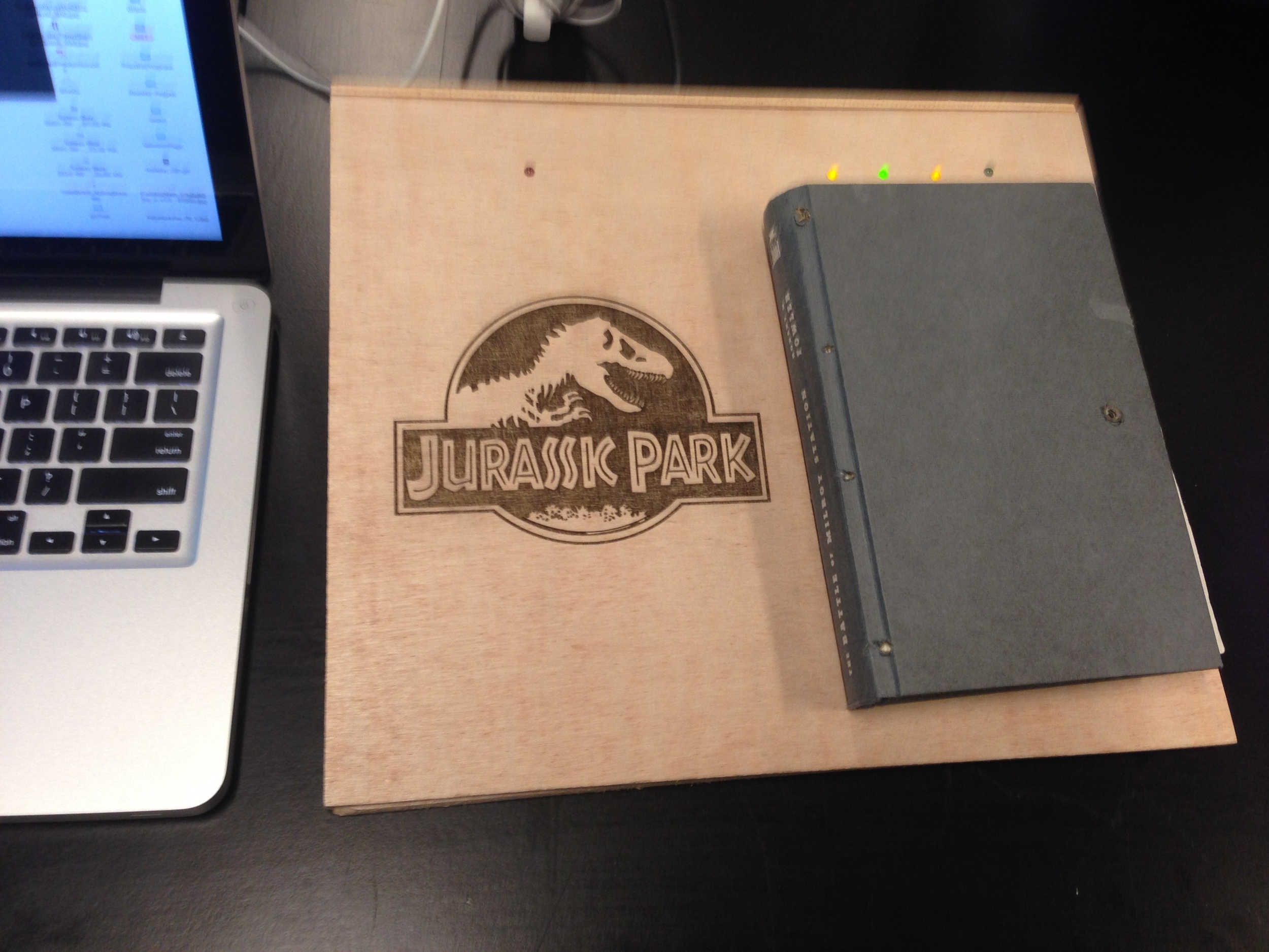
The Jurassic Park Remote is a collaborative PCOMP Midterm project with Cole Orloff.
The idea
We spent much time in developing a idea that we're satisfied with.
Here’s our idea. We want to build a “Book Remote”. Users can control the movie ”Jurassic Park”(play, pause, fast forward, rewind) by manipulating a physical “Jurassic Park“ book (open the book, close the book, turn the pages). The reason we chose “Jurassic Park” is that the movie completely follows the book.
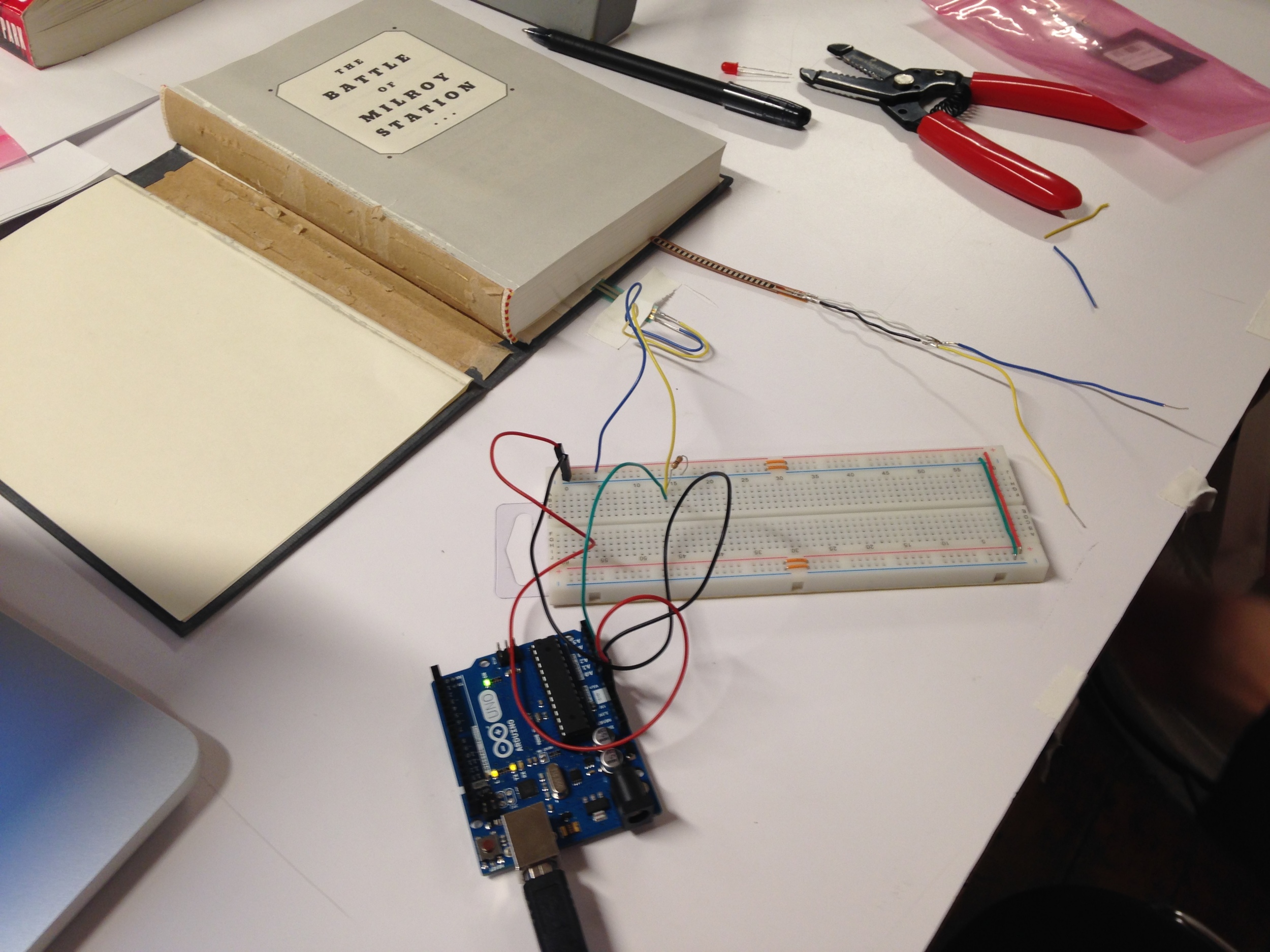
We put a flex sensor on the spine of the book, and a force sensor on the back cover. When the book is closed, the flex sensor is bended; when the book is open, it’s flat. When different weights are put on the force sensor, the force sensor would tell which chapter is opened up. We used Arduino to collect the data from the sensors, used serial communication to connect Arduino to Processing, and used Processing to play the movie on a big screen.
This idea comes from that sometimes when we read a book, we find a certain chapter is very tempting, so we want to watch the movie about it. So we think it’d be fun to build a book that can control a movie. The fun part would be we can pick one interesting page in the book, and the movie will play from that page.
The circuit

The code
In Arduino, we did two things, passing the flex sensor and force sensor's value to processing, and control the LED light along with the changing of the force sensor.
In processing
We imported a video library, which allows us using "play()" and "jump()" function to play the movie from certain part.


We did three things to make FRS more stable.
1) we used the function "millis" to calculate the time inside the processing, slow down the Processing from reading the force sensor's value.
2) we used the function "floor" to round the force sensor's value, as long as the value didn't increase or decrease more than 20, the change will not effect the movie.
3) we also set a variable called "lastchapter". only when the chapter != chapter, the movie will change.
The prototype
laser cutter


yining ·
1) Awesome logos

A little history:
The Chanel logo design was designed in 1925 by Coco Chanel herself and remained unchanged ever since. It turned out to be one of the most recognizable symbols in the fashion world with its overlapping double 'C' - one facing forward and the other facing backward. Chanel's logo is frequently seen in perfumes, purses, shoes, and jewelry.

The first reason I like this logo is that the composition is balanced. It's vertically and horizontally symmetrical. It's simple and elegant.
The second thing is the colors of this Logo. The black and white are the main colors of Chanel's clothes. The black is the essential of everything, and it reveals women's radius. Chanel made black as the color of elegance by designing little black dress in 1926. And the color white, the beginning is the white. It captures all the light, it illuminates the face and enhances beauty. I love the two colors, they are simple, elegant and represent the brand.
2) Create the ITP Logo

The logo I created for ITP is simple, it focuses on one single meaning:
The idea comes from that ITP's work is to promote interaction. The definition of interaction is a loop, is about two people constantly speaking, thinking and listening to each other. So I drew two circles representing two people, and two arrows representing the loop of conversation.
Also, the color is purple, since we are a part of NYU.

I made various sketches. First, I want to express the meaning of "new possibility" or "digital media", but they can't express the meaning very well. I also want to add mouth and ear on the circle to fully express the meaning of listening and speaking, but I'm not sure it's a good idea, cause logos should be simple and abstract. Actually, I'm confused about how simple a piece of design should be. Most of time, people say, keep it simple, don't put too much on your design, otherwise you may ruin it. But sometimes, I was also worried that it's too simple, it can't support the idea behind it.
Introduction to Computer Media
yining ·
This week I practiced using ArrayLists. First of all, I changed the Seth's "marble" array into ArrayLists.
Second, I used PImage, and looped all it's pixel colors, adjust its brightness.

Here's my code:
yining ·
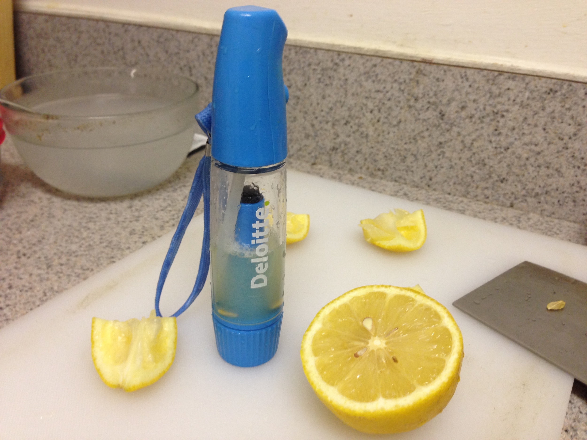
This is my business card. Because my name means lemon, so I decided to use lemon as a logo. I used the color of lemon: yellow and its contrast color: blue.
Also I designed a drinking straw connecting my name and the lemon. I
used the golden ratio to arrange my email address.
I chose this typography because it's simple, neat and a little cute. I think it can show some of my personality. I also made all my informations align to each other.
I also want my business card be more special, I sprayed some lemonade to the card, hope it can help people remember me when people smelled the lemonade. But I made a mistake. The lemonade wouldn't volatilize, so people can't smell the lemon, I will use lemon perfume in the future.
Another mistake is that I didn't make the front side and the back side suit each other. I will make it right in the future.
In addition, I used round corners rectangle for the shape of the card, to express a gentle feeling and protect people's fingers from getting hurt.


Introduction to Computer Media
yining ·
This week, I modified my code to make a "flower" class. If user click the sketch, there will be a random flower falling down the screen. Here's my code.
yining ·

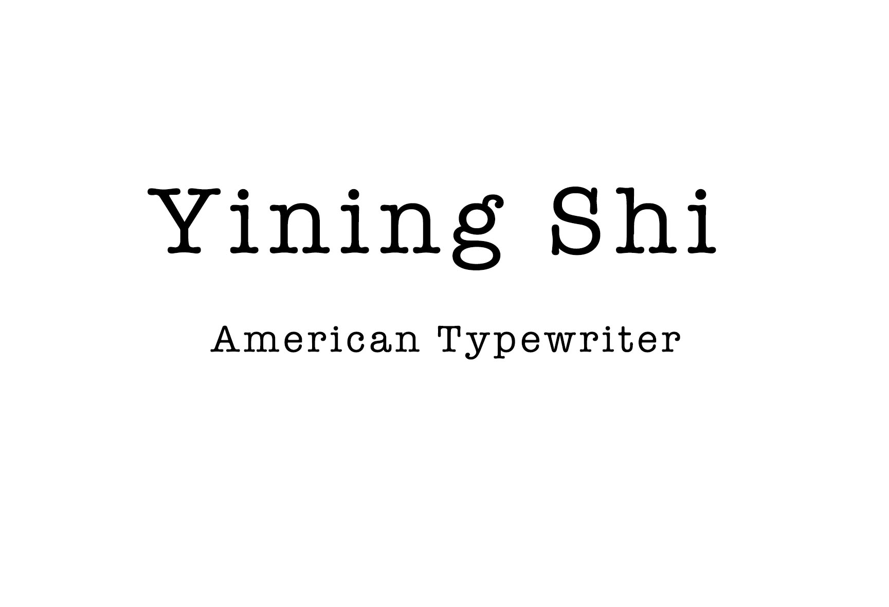
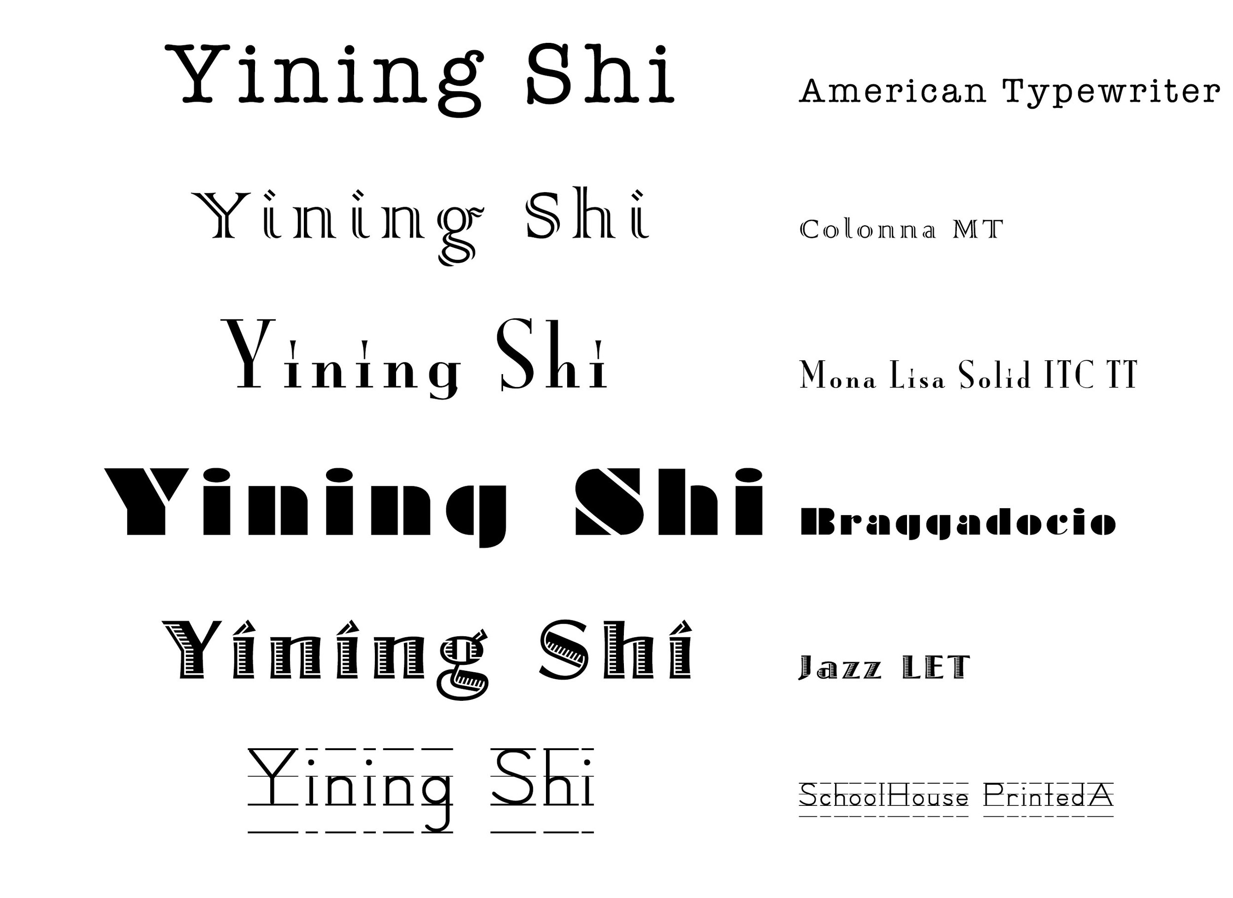 1. Every serif is so neat, especial in "yining". It's old fashioned. it imitates type writing.
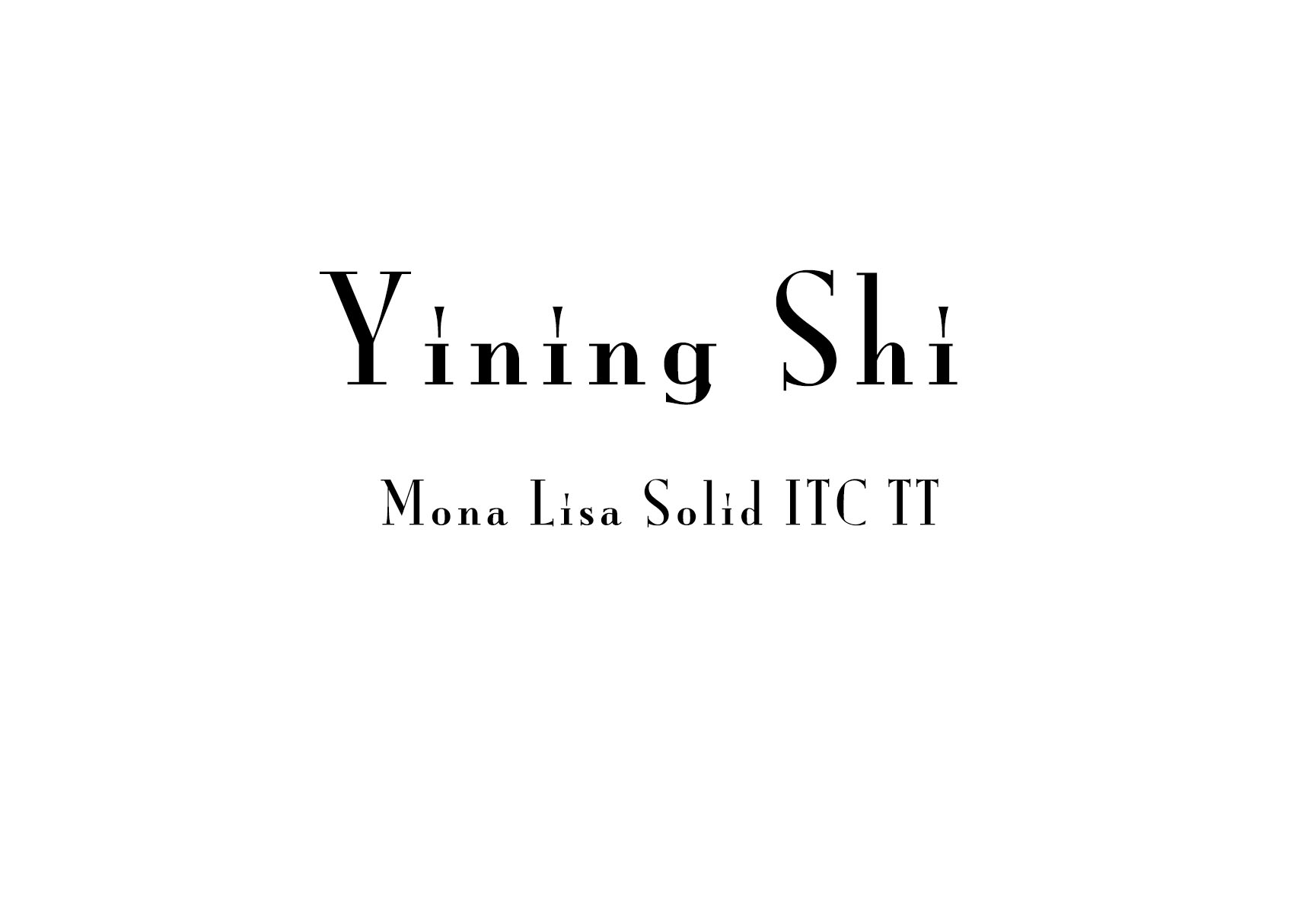
2. A roman typeface, Colonna comes with some very elegant letterforms, based on artwork obtained by Stanley Morison during 1926 as part of a program to increase the range of display faces in the Monotype library. The letters of the Colonna font have an inscriptional feel about them, figures are non-ranging. Originally developed as an advertising face, Colonna is at its best when used in large sizes

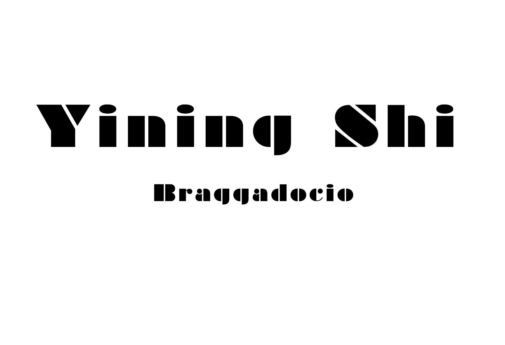
3. Big head, small body.
4. every letter is in a rectangle.
5. It looks like there's light comes from the left side.
6. school style.
yining ·
Here's my questions: Call-and-Response is always better than punctuation, right?
During the labs, I made some mistakes. They seem very easy to fix, but also very easy to make.
1. When use CoolTerm, make sure choose the right port: USB, otherwise CoolTerm can't receive the data. There's also bluetooth port in the "serial port" folder.
2. The note says the port number 12 means “/dev/tty.usbmodem1421″number. I didn't understand why. Later I figured out it's just a sequence of ports in one computer ranging from 0 - 12. Every computer have a different port list.
3. Connect the components correctly. I was careless to put the potentiometer power leg to ground, and the potentiometer control the shape in processing in a wired way.
I kept some notes about some knowledge mentioned in the labs.
1. what's serialEvent?
The serial library has a special method called serialEvent(). Every time a new byte arrives in the serial port, serialEvent() is called. That way we needn't call serialEvent function in draw() or in setup().
2. What's the difference between Serial.println and Serial.write?
For example, imagine that analogValue = 32:
3. How many bytes does Serial.println(analogValue) send when analogValue = 32?
Serial.println(analogValue) actually sends FOUR bytes! It sent a byte to represent the 3, a byte to represent the 2, a byte to tell the Monitor to move the cursor down a line (newline), and a byte to move the cursor all the way to the left (carriage return). The raw binary values of those four bytes are 51 (ASCII for “3”), 50 (ASCII for “2”), 10 (ASCII for “newline”), and 13 (ASCII for “carriage return”).
4. What's trim() mean?
There’s a command that removed whitespace from a string, called trim().
The first trims the whitespace characters off. The second splits the string into three separate strings at the commas, the converts those strings to integers:
myString = trim(myString);int sensors[] = int(split(myString, ',')); |
5. What's myPort.bufferUntil('\n');?
This line tells the sketch not to call serialEvent() unless an ASCII newline byte (value 10) comes in the serial port. It will save any other bytes it gets in the serial buffer, so you can read them all at once when the newline arrives.
Lab: Serial-to-processing
CoolTerm screenshot showing incoming bytes as hexadecimal values
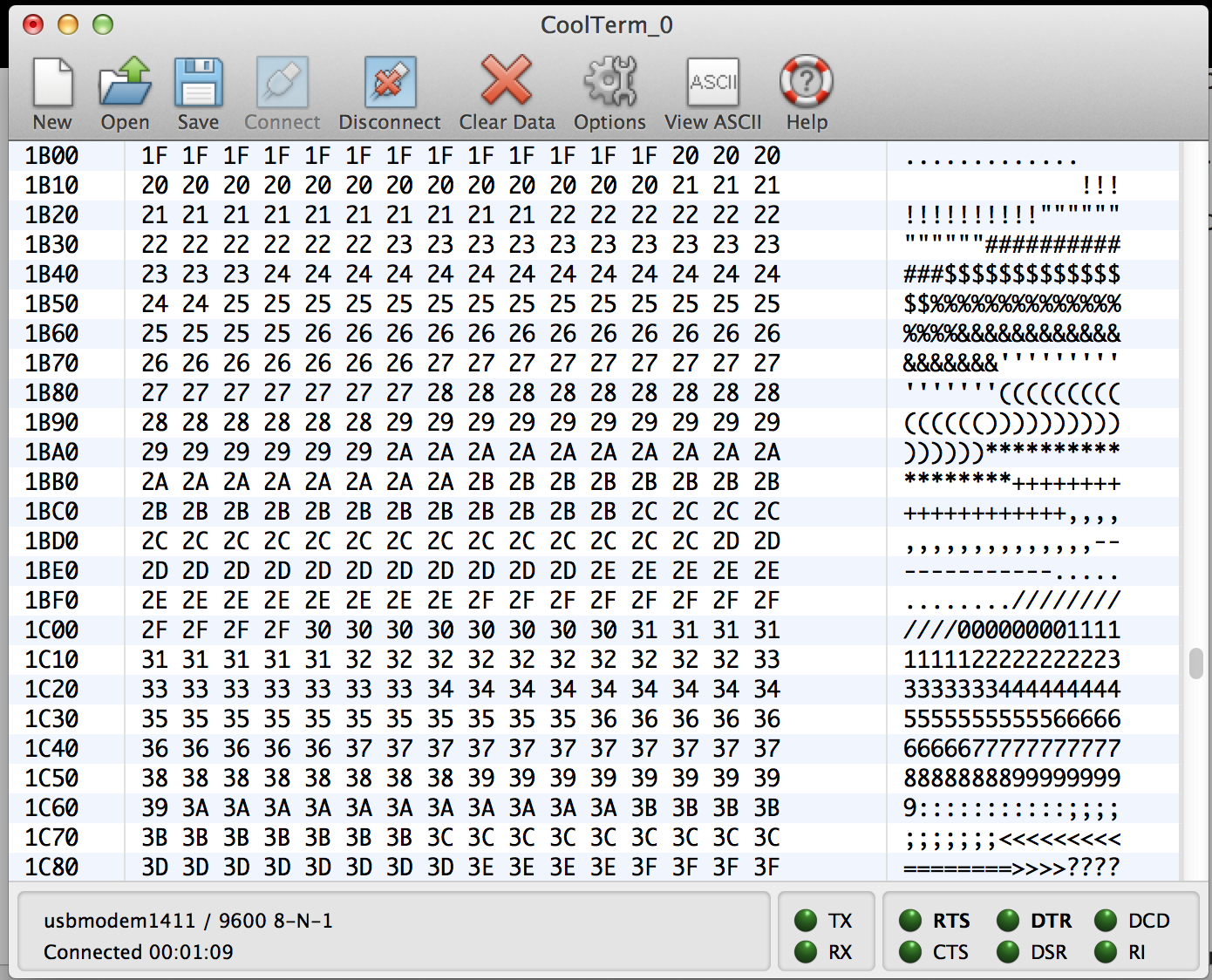
Here's code in Arduino, receiving potentiometer value from the circuit.

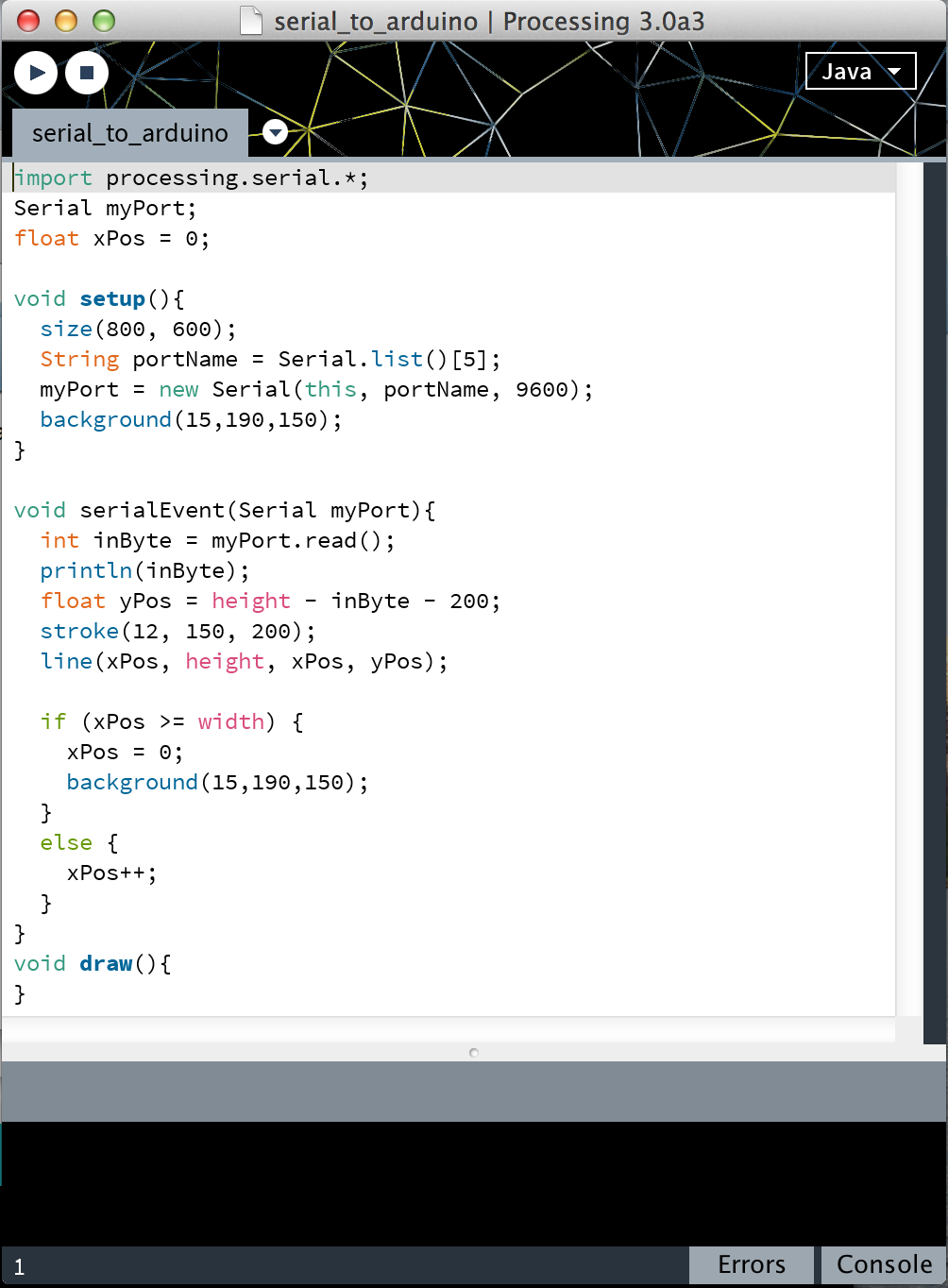
Here's code in processing. Imported processing.serial library. Found the right port in the Serial.list. Set up a object named myPort in the Serial class. In the serialEvent() function, used myPort.read to get the data, and then draw a line corresponding to the incoming data.
This is my video:
https://vimeo.com/107435685
Lab: Two-way (Duplex) serial communication using Call-and-Response and Punctuation methods
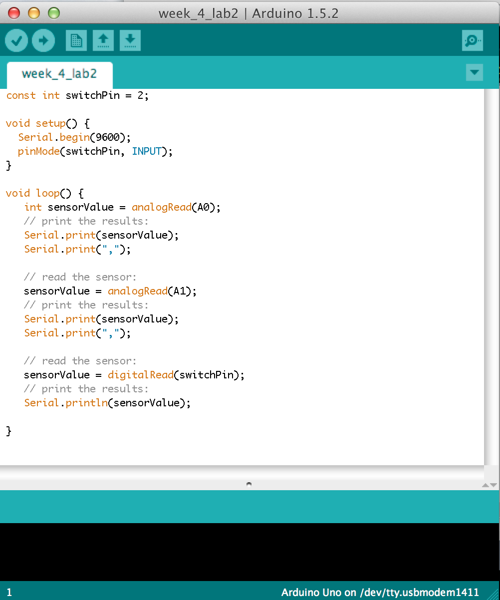
This is the code in Arduino, receiving the data from A0, A1,D2 -- acceleromete's X, Y coordinates and a switch state.
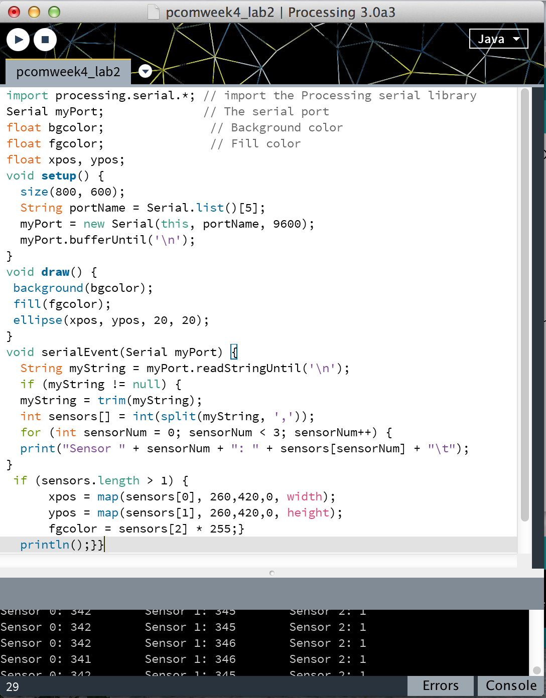
This is the code in processing. Save the serial buffer in mystring, use trim to delete space, use split to get sensor[0], sensor[1], sensor[2], and draw ellipse depending on these three numbers.
This is my video:
https://vimeo.com/107435843
yining ·
I have a question for the labs. I know that analog input should range from 0-1023, and the analog output should range from 0-255. I don't know the reason why. I suppose it has something to do with the bit and byte, but I don'd know it clearly. -----Oh, I know the reason now. Because the analog input takes up 10 bits memory, the 10th power of 2 is 1024.
During the labs, I made two mistakes.
The first one is my servo motor didn't work. I checked the circuits and check the program for several times, but the motor just didn't work. And I asked a second-year student for help. She told me before I use the motor in my program, I should test the motor alone, using the example code in Arduino to see if it works. It turns out my motor is broken, so I changed it, it works. Thanks my classmate!
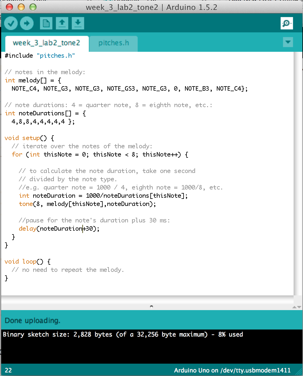
The second problem is I did not import the pitches.h library. When I compile the code, Arduino can not recognize the "Note" and the pitches.h. So I looked up in the Arduino website, and found out I should import the pitches.h myself, by adding a new tab and copy the pitches.h code in it. The link about how to import pitches.h is here.
1. Lab: Servo motor control
Here's my code.

Here's a video:
[embed]https://vimeo.com/106985065[/embed]
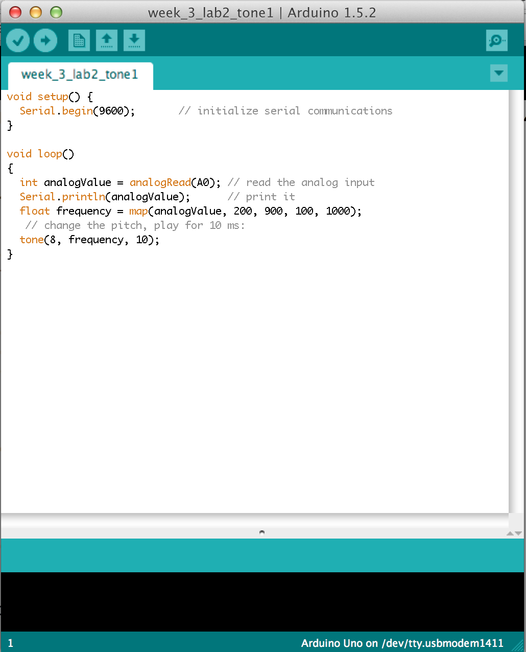
2. Lab: Tone output
here's my code.
[embed]https://vimeo.com/106985067[/embed]
I imported the pitches.h to make a little piece of music.
https://vimeo.com/106985068
I didn't find the force sensor, so I replaced them with flex sensors. to touch each sensor to make different note.
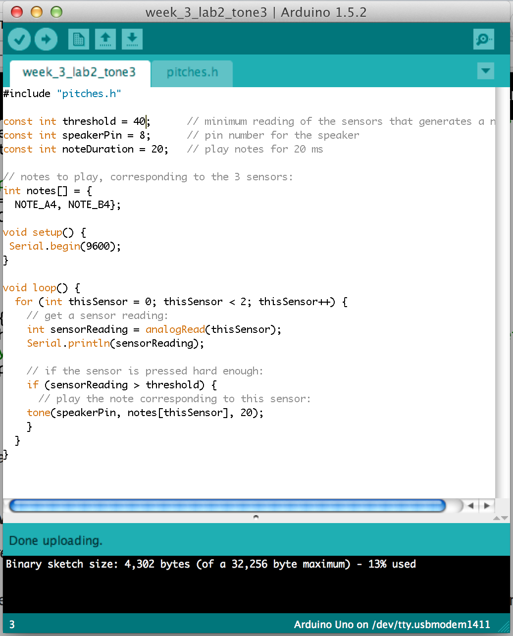
https://vimeo.com/106985066
yining ·
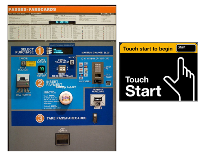
This week I picked the subway Ticket Vending Machine in New York City as my observation object. The reason I started to pay attention to the Ticket Vending Machine is that this is designed by a ITP graduate. The old Ticket Vending Machine interface is very, very confusing. People don't know how to start with. But the new interface is very simple. Everything starts with the "start" button, and users can go though the whole process by making choice on the screen. The picture below is about the old and new interface.
This is the interface of the Ticket Vending Machine. There's a good design idea about the new machine. The designer uses color in purpose. The green region is where the green money goes. The yellow region is where the yellow Metro card goes. And the blue region is for credit cards which are most is blue. I think the matching color instinct can help users, even many users don't realize the design idea behind this.

I think another cleverness about the new design is that instead of showing users the whole function the machine can do, it hide the confusing details to the users, and simply leave clear clues to the users, so that different users can get what they want and do not need know other functions. The new interface has a clear brach logic to help user go though the process, like the picture showed below.
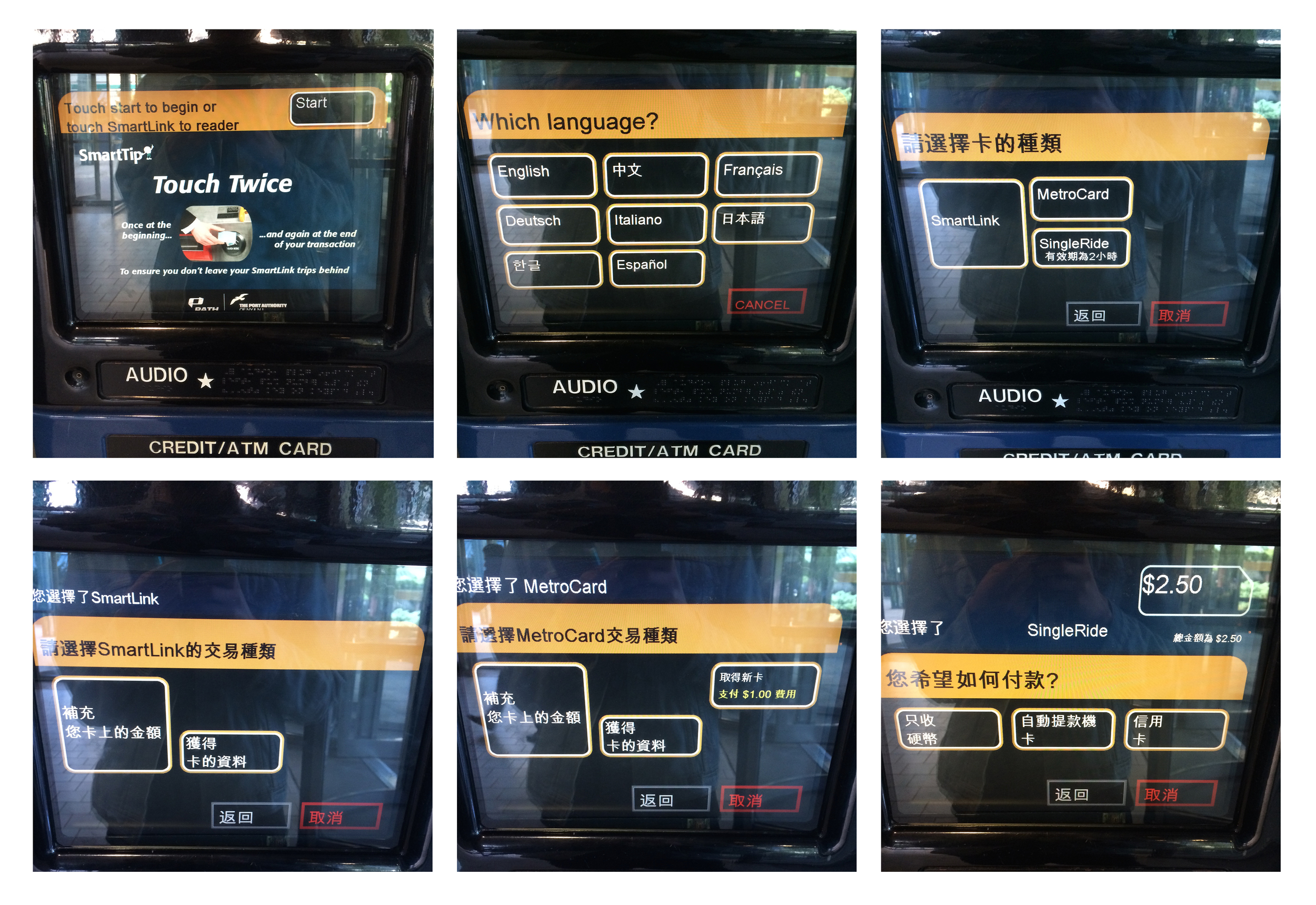
Here are steps for me to use the machine to fill my smartlink card (A type of card for people to take Path train unlimitedly in a month).
Ok! I said a lot good words about the machine, it's time to complain about its certain features. :P
difficulties and the easy parts:
When the first time I used this machine to fill my card, I encounter a little bit serious problem -- I can't dip my debit card to make a successful transition. Maybe I dip the card too fast or too slow, I tried four times in total to make the payment. My chase account appears four times payments, and my card was only filled once. So apparently, the machine can recognize my card at each time, if not, my chase account would't report the transition. So this is a problem should be fixed.
The easy part is to touch the "start" button and make choice at each stage to go through the process.
Time:
I observed the people who using the machine in the 9th St Path station on sept. 22nd. I saw 6 people used the machine. Three of them seem familiar with the machine. They bought the ticket within 1:30 minutes. And for the rest of people, their action were much more slow. They hesitated about the information on the screen. One person looked around and wanted to ask for some help. And I came to help her, she couldn't insert cash successfully. I didn't know what to do either. So she used her credit card. So it seems to me that the most difficulties happens when users make the payment. Other parts are just making choice on the screen, which should be east for most people.
After reading Crawford and Norman's article, I became more aware of the importance of usability. Well-designed objects are very easy to interpret and understand. So I like the new Ticket Vending Machine that hide the technical details from users and make the process easy to use and understand.
Introduction to Computer Media
yining ·
This week we learned function. The homework is to take the idea for a design and break it out into its own function. Add parameters to the function so the design can be drawn differently based on the selected parameters. Draw three or more instances of the design on the screen to show the differences possible by changing the parameters.
I built a function called flower, it has four parameters to decide the position, the height, the size, the number of petals. And when you move the mouse vertically, the center flower's size will change; when you move the mouse horizontally, the number of the petal will change from one to 60.
Here's the screen shot of my work:

here's my code:
yining ·
This week I read "The Secret Language of Signs". And I also read "A world without Signs: will the GPS kill the sign?" because I'm interested in this topic. And after reading them, I have four thoughts to share. 1. The first article talked about the importance of signs. Because of Georgia's failure to install adequate signs, Bluffton University’s bus accident killed seven people. Before I read this, I know the signage is important, because it tells us where we are and where should we go. But this article told me this only happened when the signage works well. If the signage did not work well, in some extreme cases, like Bluffton University’s bus, the consequences can be fatal.
2、Good signage is the bridge between Google Map and our real destination.
Today we found the advent of GPS systems that makes us less dependent on the signage. Beatty, a satellite navigation specialist, believes one day we trust digital directions so completely that we no longer need signs. I don't agree with Beatty. I think good signage is the bridge between Google Map(the virtual world) and our real destination.
As a person who constantly gets lost in the New York City, I could use my "rich" wayfinding experience to prove my view. Let's say I want to find a restaurant named Sake Bar Hagi, 152 W 49th St. The first thing I do is to open Google Map. It tells me this:
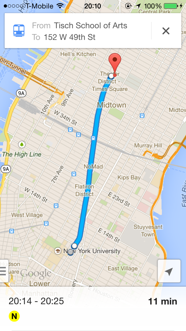
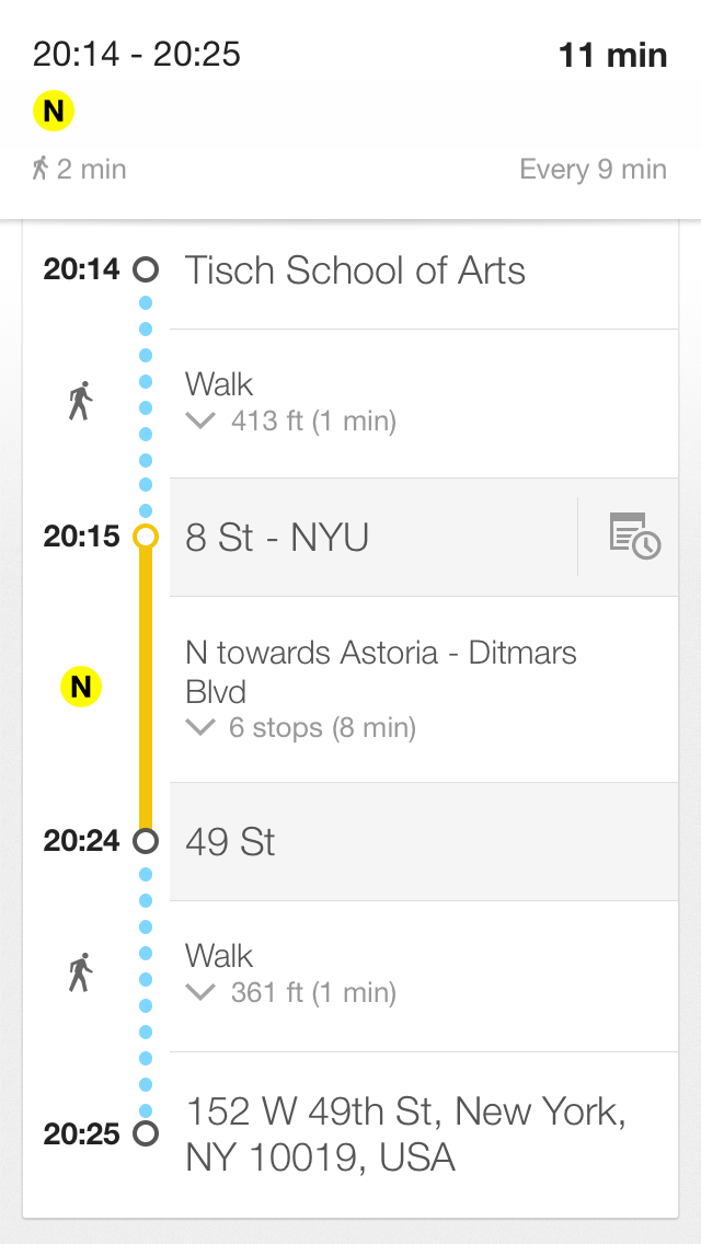
I will hold my phone and look for the signs all the way to the restaurant. The subway station and the restaurant sign is not just simply give me conformation. These signs keep me going forward to my real destination. Imaging there's no sign around the subway station, I may be failed to get into the station.
3. The article also says that security guards and secretaries were often the ones to help orient the lost. It reminds me that besides the Google Map and the signage, there's other important way we can find our way--asking other people.
My strategy to find my way is a) using the map; b) looking for the sign; c)asking other people. There's one time I used Map to find the 33rd street path station. This station hides in a mall. The Map said it was very close to me. But I just can't see it. So I asked a man. He asked me, "Can you see the M sign over there?". Unfortunately I couldn't. In the end, he walked with me to show the path station entry. So when the map and the sign failed, we have the third option. So I think there could be a new interactive tool for helping people find their ways. We can combine the signs and the map to build smart signs. You're confused with the map? You can't find the sign? That's okay, I will show you the way. I hope in the future, there would be new interactive wayfinding tools acting like human beings who offer sweet service to people.
4. Article said visitors often plan their routes online. Sometimes text on a Web site is more useful than text printed on a wall. I share the same feeling with these visitors. There's one time I would go to health examination in someplace I don't know. So I searched the Internet and found a strategy blog teaching you step by step about how to get to the place, "the elevator was on your left hand, first go to the second floor to do blood test", and so on. The author was so nice, he told you everything you should know, most situation you will encountered. And after reading this, my examination went very quickly and smoothly. So I think the advanced online information is useful and sweet.
yining ·
This week we learned about signage. Signage need to be clear, concise and intuitive. Including more than one instruction on a sign is often the reason why a sign fails. The sign I like: Pedestrian Crosswalk Sign in New York City.

I had never see this sign before I came to New York City. The pedestrian crosswalk sign I'm used to is composed of green and red lights, green means walking, red means stop. But I understand the new sign when the first time I saw it. The orange hand means stop, the walking man means walking. The sign is very figurative and intuitive. I think the new sign is better than green&red light, because if "green=walk" is not a common sense, people won't get clear and right information.
The signs can be better:
1.

There's red sign"ERNST & YOUNG" on the right side of the picture. Because it's written in vertical, the two words are cut into serval single letters, which offer little meaning. Though the sign is in red color, it's still unreadable to me. But someone will argue there's little space for writing a sign horizontally. But I think it can be better by learning from the "MOMA" sign. It's vertical, but it's readable. I think there's three things I can learn from the MOMA sign.
(1) rotate all the letters 90 degree to the left. In this way, the letters are in vertical but they're not isolated, they're still stick together.
(2) Use legible fonts, and not all upper case.
(3)make the words short.
I think if the "ERNST & YOUNG" sign follow these rulers, it can be much better.
2.
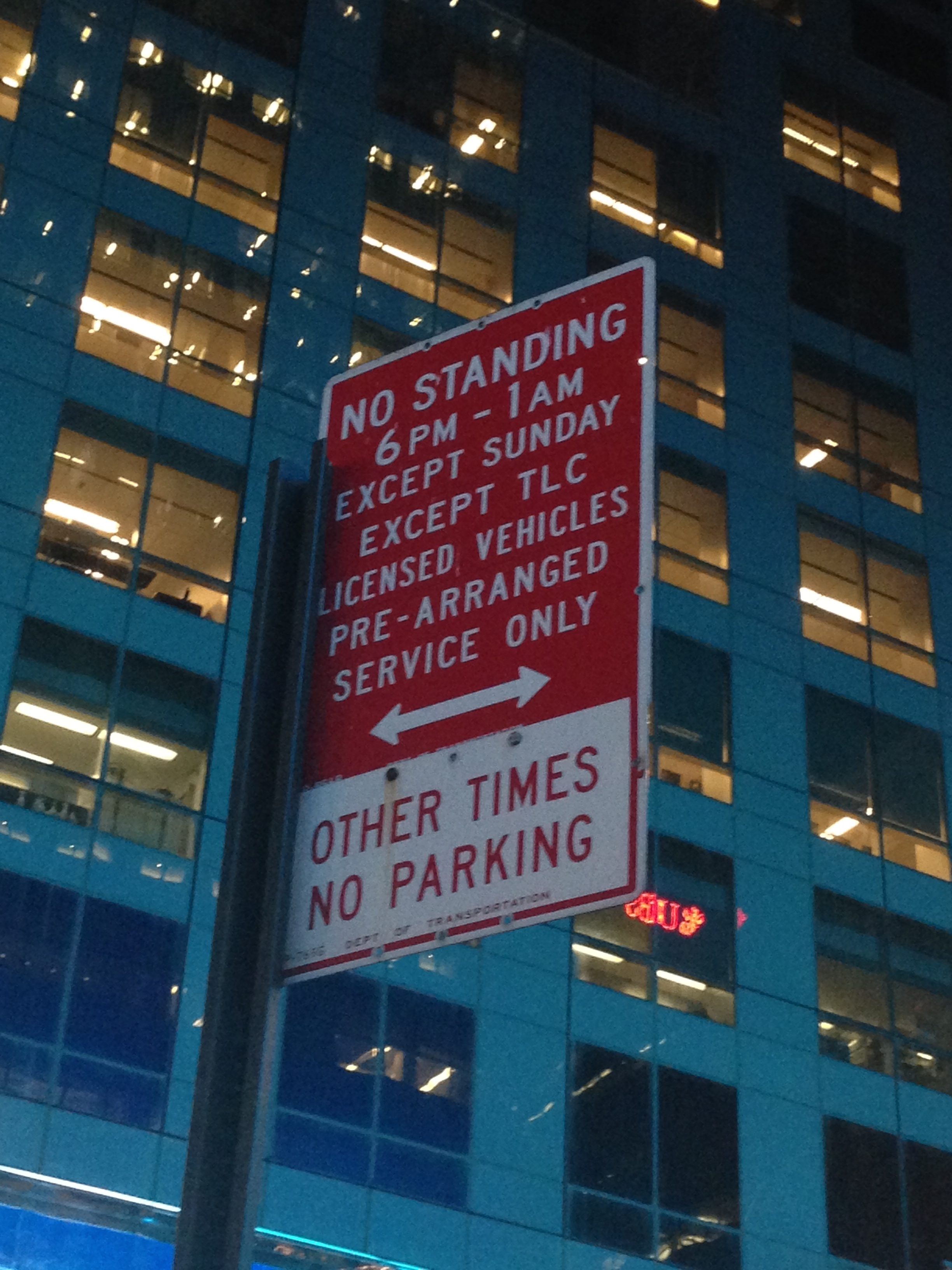
This is a parking sign on 49th st. What confuses me is "OTHER TIME". Because the time"6 PM-1 AM" is far away from "OTHER TIME". Also it uses all upper case letter, it's little unreadable. So I redesigned it.
3.

Basically, I can understand the sign says, people can leave the supermarket trolleys, especially there're some empty trolleys under the sign. But I don't understand why the trolley is tilted. When I leave a trolley, I wouldn't make it tilted.
Redesign the sign:
parking sign:

yining ·
I recorded the sound in the subway station, and a conversation happened in the train, and mixed them with a song called Bullet train. https://soundcloud.com/septends/yining-videosound-assignment
I'm inspired by a poem called the commuter's lament. The poem is printed on the ceiling of in a subway station. The poem expresses every commuter's feeling.
Here's the conversation happened in the subway.

I want to express the feeling that in the morning, in the subway train, people are tired, overslept. But the train is so fast, the life is so fast, drives us to reality. Just like a song's lyric:
This is our decision to live fast and die young. We've got the vision, now let's have some fun. Yeah it's overwhelming, but what else can we do? Get jobs in offices and wake up for the morning commute?
yining ·
Norman, Design of Everyday Things: Norman emphasized in the first chapter that well-designed objects are very easy to interpret and understand. And the principle of them is: provide a good conceptual model, and make things visible. He gave a lot examples in everyday life to prove his view. I agree with him a lot. To me, human is sensitive and adaptive, and the machine follows a series of rigid rules. So it make the interaction between human and machine difficult. (Look at how we use a programming software to debug our program. When the program went wrong, the interpret that software gives us is so different with what we think of.) So a interaction designer plays a very important role in the whole process. It's a little bit ironic that it will takes so much effort to design a product that seems so easy and simple to use.
Norman, Emotional Design, “Attractive Things Work Better”:
Pleasing things work better, are easier to learn, and produce a more harmonious result. --Norman
This is the first time I heard this kind of opinion. I'm not entirely agree with these words. For many objects, yes, they're subjective for users. Even they're all very usable, some users prefer this and others prefer that. Yes, the preferable depends upon the occasion, the context, and above all, upon my mood. However, there other designs that almost everyone likes. Like the Apple products. I don't think Apple fans don't like these products in some context or in some mood. Why many people are so obsess to Apple product is always a mystery to me, although I'm a fan too.
Igoe, Physical Computing’s Greatest Hits (and misses):
This article gives me so much inspiration. Because I have that kind of idea that many things have been done before, they're not original. This article told me that there’s a lot I can add to these themes through my variation on them. And I was worried about what to do in the P-com class final project, these themes opened my eyes to some fields that I didn't considered before.
I think the Floor Pads is a smart idea, because it's simple to make and it gives user so much fun. And these floor cubes is corresponding to salsa dance steps. However, I think there's something can be added to this project. Dancing is not all about the steps (expect Tap dance, haha). It also contains movements of other parts of the body. I think we can use a Kinect to catch users body movement, and teach users how to dance in a more comprehensive way!

I also like the Gloves project, because it's instinct for people to tapping on something with your fingers to make a rhythm. Also, a designer should make a very good rule system for users, like move your finger in this way can make this kind of music. I saw a project of my friends that is similar to the Gloves project. I think the rule system are pretty stranger for many people, and it almost ruins the user's instinct. Also, I want to find a way that users are not require to wear sensors on their hands. Maybe we can use the Leap Motion device to achieve this.
Introduction to Computer Media
yining ·
This week, we should work with rule-based animation, motion, and interaction. I made a bouncing bubble that will change color when it hit the boundary of the screen. And also, if you click the mouse when the bubble is in the gray rectangle, the ball will get stuck in the gray rectangle.
I also want to draw more bubbles, but I encountered many bugs. I'm trying to figure it out.
 And here's my code.
yining ·
Original image:
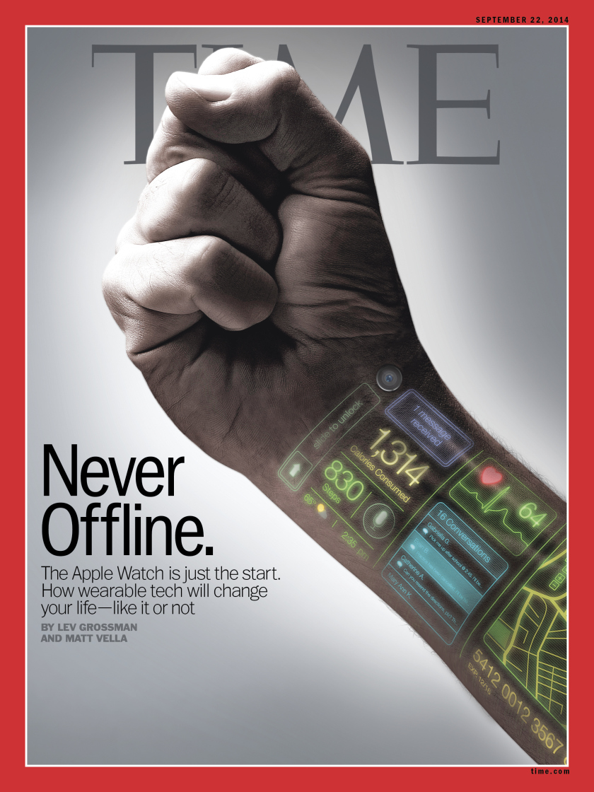 This is the cover of the latest issue of TIME magazine on sep 22, 2014. The cover makes me think about the news of the Apple Watch. Instead of simply showing readers a man wearing the Apple Watch, the designer left some digital icons on one man's wrist to tell readers much more information. The first icon is the classic unlock icon which remands me of Apple company. Other icons show the received messages, consumed calories, current weather and temperature, and the user's heartbeats. They tell us what can the new device do for us. I think the cover is a smart design, because it leaves clues to tell readers the story, where to wear the device, who designed the device, what can it do for you, not just simply showing them the product.
Also, the hand is making a fist. I think it refers that this new technology is a kind of strong force that can change everyone's life. It's also consistent with the title of this issue's main article, "how wearable tech will change your life". And I think another reason that designer don't put Apple Watch is that "the Apple Watch is just a start". There will be more fantasy device on the way.
Underlying grid:
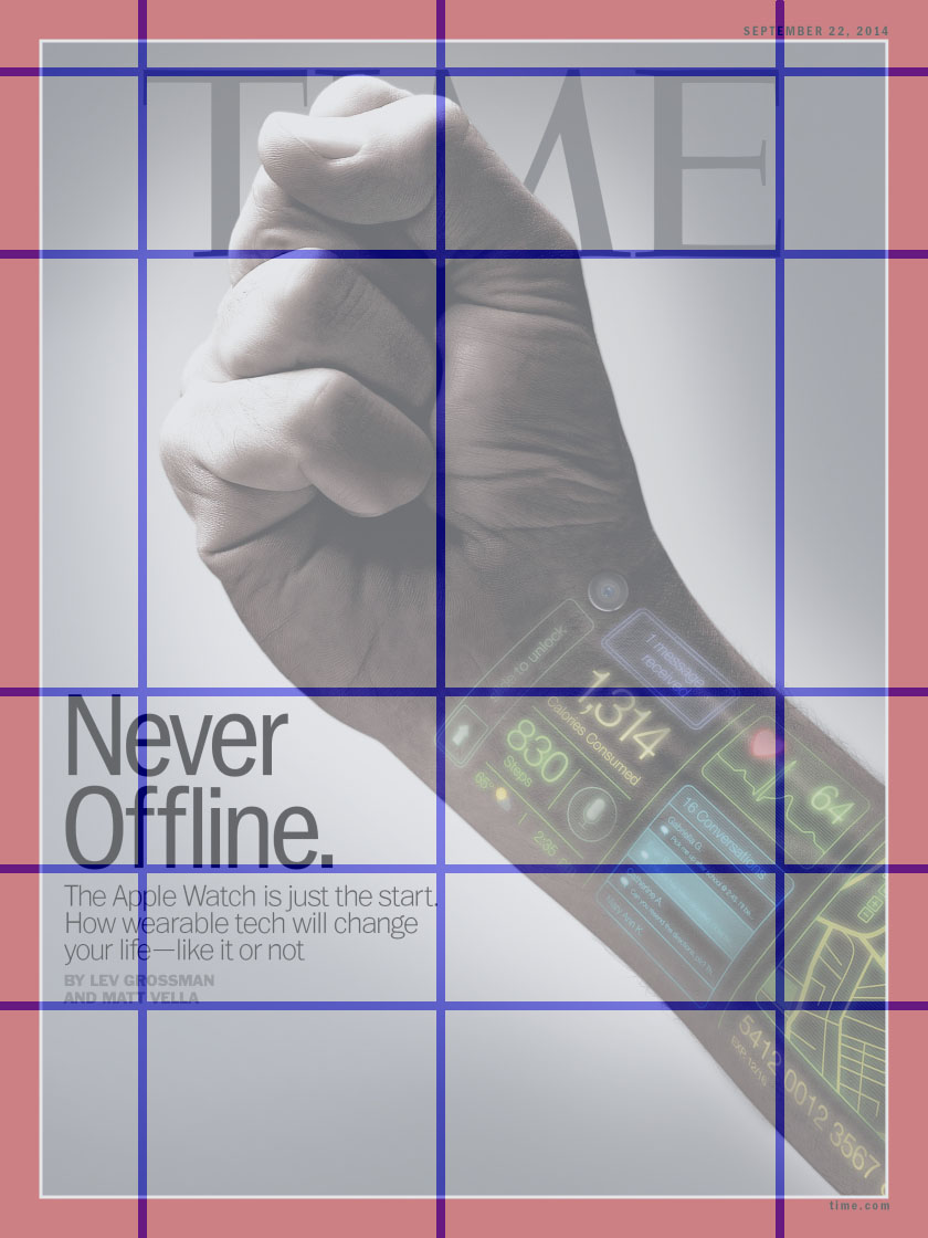 The grid is based on the fist and the texts. Horizontally, the first line is aligned with the top of "TIME" and the top of the fist. Other lines are aligned with the text. Vertically, the grid is aligned with "TIME". The title of the article is on the left side of the picture, and the fist is in the center of the picture. In addition, to me, the whole hand breaks the grid at 45 degree angle, which highlights the hand itself.
Typography:

1. "Never Offline":
The typography of the letters "Never Offline" is ITC Franklin Gothic Std Condensed, designed by Vic Caruso, from Adobe. I googled this typography and learned some background.
(This typeface is a standard choice for use in newspapers and advertising. In 1991, David Berlow completed the family for ITC by creating compressed and condensed weights. ITC Franklin Gothic Compressed is designed especially to solve impossibly tight copy fitting problems, while maintaining high legibility standards. ITC Franklin Condensed provides medium weights of narrow proportions. It is frequently seen in newspapers, advertisements, posters, and anyplace with space restrictions.)
2. "The Apple Watch is just the start."
The typography of "The Apple Watch is just the start" is Trade Gothic LT Std. Trade Gothic is similar to Franklin Gothic.
(Trade Gothic was designed by Jackson Burke between 1948 and 1960 for Linotype. In the nineteenth-century grotesque style, like News Gothic, Trade Gothic has a large x-height. Trade Gothic, with its condensed faces, is a classic design for newspaper work, particularly for headlines and classified advertising. The condensed versions increase the versatility of the typeface, particularly for setting headlines and subheads.)
3."By LEV..."
The typography of "By LEV..." is Emigre Mr Eaves XL Modern.
(It features a larger x-height than Mr Eaves Sans with shorter ascenders and descenders and overall tighter spacing. Mr Eaves XL allows for a wide variety of uses and is perfectly suitable for lengthy text settings. The larger x-height also maintains superior readability at smaller point sizes.)
The three kinds of typography have one common feature that is large x-height. And they are suitable for anyplace with space restrictions.
Color:
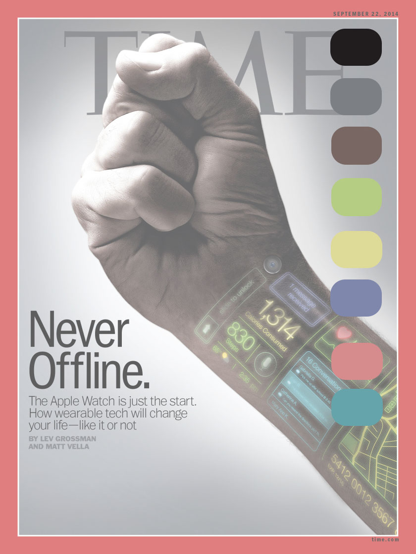
The main color are black, gray, and white. And there are five side colors. The side color express the device's rich functions.
Negative Space:

The negative space envelopes the hand and the text. And there also a white circle around the hand. In this way, reader can focus on the hand and the text near the hand.
yining ·
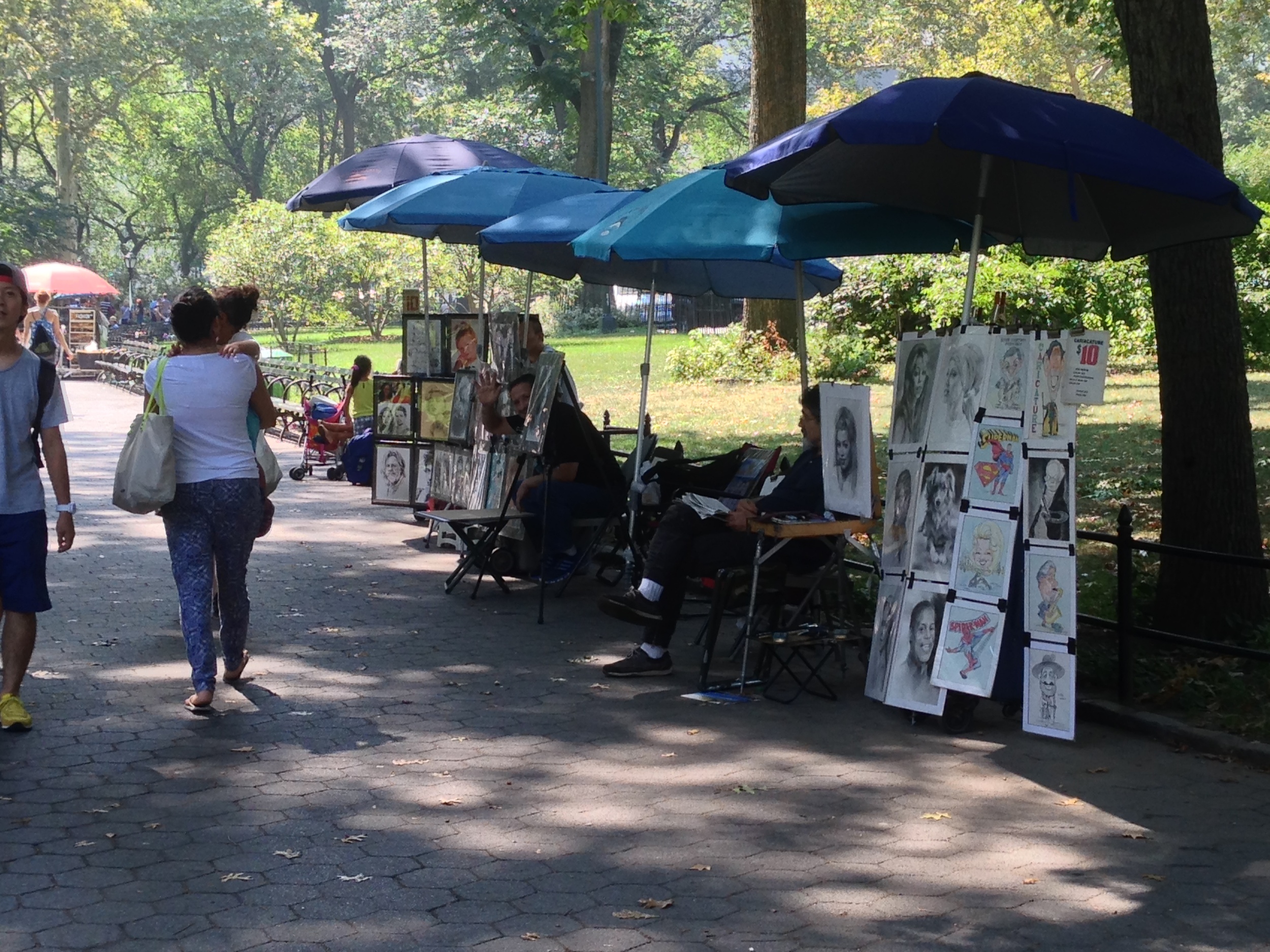
This is the first time I experienced a Sound&Art work. I heard a woman's peaceful and sad voice, the foot steps, the songs, the sound of the birds and trees and other sounds. All the sounds felt so real and dragged me into woman's story. Sometimes, I felt a mom spoke behind me, and sometimes I listened a man singing far far away from me. The sound is 3D, it creates an experience of physical immediacy. I'm so fascinated to this technology, and want to learn how to build sound like this. I heard about this technology before. This time, I googled it, and figured out its principle. Binaural recording is a method of recording sound that uses two microphones, arranged with the intent to create a 3D sound sensation for the listener of actually being in the room with the performers or instruments. Actually the principle is simple, the experience is very appealing. In the sound walk, I retraced the footsteps of an dark-haired woman. Listening to the instruction of the woman voice, and I saw the ice cream car and portraitists she's talking about. This is a amazing way to see what's the artist seeing, to hear what's she hearing, to feel what's she feeling, and in the end understand what's she thinking. Here's is the ice cream car and portraitists picture I took. Look, a portraitist was waving at me.

In the journey of tracing the woman's footsteps, the pictures really help to get me into the story. My favorite story is that the author encounter a man when she's looking at the this picture below. The man said, the woman in the picture is like his mother who has long black hair. His mother left him and went to New York City when he was 7. His dad wouldn't let him talk to his mother, and was just sitting ing the kitchen, drinking. The man blamed his father for this, but now he realized how sad was he. And then the man asked author what time is it, he had to go back to the hotel, because his wife may come back soon. I saw the impact from one generation to the next generation. The leaving happened in the man's childhood make him more care about his wife and their happiness.
There are so many information in the all journey. The local history, opera and gospel music. The other story moved me is the polo bear. The polo bear is like a slave, A man's suffering voice speaks for the polo bear and show us the history of the slavery. I also find many things changed since author's visitor in 2005. There is no pole bear in the park anymore. The last polo bear died in last year. They were too old. And this made me started to think, after the time went by, the pain will disappear, and people can finally have a happy ending, just like the men who doesn't have a happy childhood, but he has a loving wife in the end.
yining ·
Before I watched the 2 videos and read the 2 articles, I thought that originality is really good, but it also confuses me. Because back to the fourth year of my college, I was asked to design an interactive tool for children to learn some basic programming concepts. At first, I was very excited about designing something on my own, and I wanted to come up with something really "original" and cool. But after trying to build my original tool for 2 weeks, I found it's really hard for me to create an idea from nowhere. So I asked my advisor for help. She suggested me to get to know others' great work from their papers, and find their advantages and disadvantages, and think about how to improve their work. I did much literature review, and got inspired by many great ideas. Finally, I developed a new idea based on the work from MIT Media Lab, but my tool has two more advantages than MIT's work. And in the end, our work got published on a international conference(Interaction Design for Children). This experience made me start thinking about the originality and the value of one's work. And I believed the value of one's work matters more than its originality since then.
After I read the articles and watched the videos, I learned a new point of view: maybe there is no originality. I have to admit that I never thought this before, it really blew my mind.
In the "embrace the remix" video, the speaker said, "Creator of everything is a Remix , we're always depend on each other". Bob Dylan said, "you can copy, transform and combine to make your own work". The rich example in the video made me agree with its view. Steve Jobs' Multi Touch is one example that really convince me. Many technologies in Apple's devices is really not original, like Multi Touch and "Pull up to see the menu" and so on. Some technologies are even already used on Android's phone three years ago. It seems very ironic that many users always accuse other company plagiarize Apple when they see some common features on two devices from the two company. I'm not saying that Apple plagiarize other company, I'm saying that being purely original is impossible and there must be something more important than originality. In this case, Apple seems more successful than other companies, although other companies brought up new technology first. I think it's because Apple made users believe in it, believe Apple is the best, is the most creative one.
In "The ecstasy of influence" article, a word caught my eyes--cryptomnesia. Cryptomnesia is a memory bias that occurs when a person mistakenly believes that they have come up with an original thought, idea, song or joke, when it was actually generated by someone else. The author also brought out this question "did Nabokov consciously borrow and quote?" I started to think, if a person unconsciously borrow other's idea, does he break the patent law or not? Or if a person consciously borrow other's idea but his work is valuable, does he break the patent law or not? At this time, I don't the answer, and I started to double the patent law...I googled the purpose of the patent law. It says, "The basic aim of patent law is the balance of the interests of inventors on one hand and the interests of the public on the other hand. The inventors are rewarded with a limited exclusive right on their invention, for providing technical progress to the public." I think the inspiration that comes from inventors is a important part of their contribution to the public. So I couldn't help but standing on the side of the JOY GARNETT in the "MOLOTOV man" article.
Now I have a philosophical question. In the "Allergy to Originality" video, it said,"every book is rewritten." If everything new is rewritten or re-performed from an old one, where did the very first one idea come from? I know this question maybe a little strange, but I was just wondering.
yining ·
What is Interaction? Chris Crawford said, interaction means conversation, requiring three steps, listen, think and speak. It's a brilliant idea to describe interaction. It reminds me of another example that is pretty similar to interaction: two people playing the chess. One person sees his component's last move, and thinks about what to do with it, and then makes his own move, and the other person continues and does the same three things. But I realized there's is a obvious difference between playing chess and interaction. The final goal for playing chess is to defeat your opponent. Everything you think, every move you take while you playing chess is to achieve this one single goal.
But how about interaction? What's the goal of interaction? I started to think the definition of interaction from this question. Cause nowadays everybody talks about interaction, I was wondering why the interaction is so important, why people are going to interact with other people or the computer. I'm not sure if this is a silly question. I cannot figure out the answer, so I went back to the beginning. Interaction share much common with conversation(listen, think and speak). And I believe the goal of conversation is to exchange dynamic ideas or feelings. So I think the goal of interaction is also to exchange dynamic ideas and feelings. Speaking of exchange, it requires two people understanding each other and expressing their ideas and feelings clearly. It's pretty much the same thing as listening and speaking. And when I say the ideas and feeling are dynamic, I mean different input causes different thinking and then, the thinking causes different speaking. The ideas and feelings changed in the whole process of interaction.
By the way, I had so much fun reading Chris's article. He gave many interesting examples to make the definition and the features of interaction much easier to understand. I also learned much important knowledge. I learned the difference between interaction design and interface design. the interactivity designer considers both form and function and is stronger in the art/humanities. Also I learned that interactivity is new and revolutionary, yet tried and true; it can make us more engaged into activities than other medium; it’s the essence of the computer revolution; and it’s unknown territory.
And Bret Victor’s rant talks much about the future interaction should be more powerful than Picture Under Glass. The future interaction should use our hands, because our hands can intuitively feel and manipulate things in rich ways. So Victor proposed a more intuitive interface.
How would you define physical interaction?
I think the physical interaction embraces the richness of human interaction with the physical world. Actually I think anything that jump out of the graphical interface(the 2D world) could become a kind of physical interaction. Not just our hands, we can use our mouth, our ears, our whole body to explore all the possibilities in physical interaction.
There's one thing I want to talk about. People may think that the graphical interaction (or like Picture Under Glass) is not as good as physical interaction. I don't agree with them. At first, I like the physical interaction more than the graphical interaction. But, there's no clear evidence that can prove physical interaction is better than graphical ones in the human-computer interaction research field what so ever. The situation is subtler. It just proved that the physical interface might be better for certain situations, or to be more specified, better for certain leaners in certain phases of the learning process. And from my point of view, graphical interface could offer richer visual information. So I think it's necessary to combine physical interface and graphical interface to offer users the flexibility to select the most appropriate interface for a given situation.
What makes for good physical interaction?
Intuitive. Human already learned many ways to feel and manipulate objects, so we could just use this advantage. In addition, it's hard for users to learn a brandy new interactive method. It takes time and patient, which will decrease the fun of using the tool.
Are there works from others that are good examples of digital technology that are not interactive?
I think the good example will be the telegram. It's a great invention of that time, but as Chris said about spreadsheet programs on big computers, it takes too much time and contains too little information. One person went to the Telegraph Office and sent a few words to the another person and waited, waited until he got a very short message a couple days later. I wouldn't say there is no interaction in it at all, but I think the interactive method in this case is too simple and boring to be called interaction.